15 Powerful UI/UX Design Principles Every Designer Should Know
When someone lands on a website or opens an app, they decide within seconds whether the experience feels smooth or frustrating. That reaction is shaped by layout, navigation clarity, readable typography, thoughtful color choices, and how naturally the interface responds to actions. Behind all of these elements are UI/UX design principles that guide usability, accessibility, and interaction flow.
These principles are not design trends or personal preferences. They are grounded in research, user behavior, and proven usability standards. When applied correctly, they help create digital experiences that are functional, visually balanced, responsive, and meaningful.
In this blog, we’ll break down 15 powerful principles and explain how each one establishes clear structure, streamlines interaction, and supports intuitive user journeys.
What are UI/UX design principles?
UI/UX design principles are structured guidelines that help designers create interfaces that are logical, usable, and visually organized. They define how layout, navigation, color, typography, and interaction patterns should work together.
These principles are not about decoration. They ensure digital systems support clear communication and efficient task completion. They reduce friction and strengthen engagement.
1. Clarity
Clarity is the foundation of all effective digital interfaces. If users cannot understand what a page offers within seconds, engagement drops. Clarity is not only about simple language. It also involves a well-organized layout, logical grouping of content, and visual organization.
For example, clear headings allow users to scan content. Direct button labels such as “Download Report” perform better than vague text like “Click Here.” Clarity also depends on spacing. White space (negative space) prevents visual clutter and separates information logically.
Clarity improves trust. When users understand the interface, they feel confident taking action.
2. Visual Hierarchy
Visual hierarchy guides attention by signaling what users should notice first, second, and next through size, contrast, and prominence. Humans naturally scan content based on size, contrast, and placement. Designers use this behavior to guide attention.
Large headlines draw focus first. Strong color contrast highlights primary buttons. Subheadings break long sections into manageable segments. Alignment strengthens this hierarchy by organizing elements cleanly.
Without visual hierarchy, users struggle to prioritize information. With it, the interaction flow becomes smooth and intentional.
Ready to Build an Interface That Actually Works?
Let’s turn smart design principles into a digital experience your users enjoy and trust.
3. Consistency
Consistency reduces cognitive effort. When elements behave the same across pages, users do not need to relearn patterns.
Navigation menus should remain in the same position. Button styles should not change unexpectedly. Typography systems must follow a structured hierarchy. Consistency across color systems also strengthens recognition and branding.
In the principles of UI/UX design, consistency ensures stability. It builds familiarity and prevents hesitation.
4. Simplicity
Simplicity removes unnecessary noise. Digital interfaces often suffer from feature overload. While functionality is important, too many visible options overwhelm users.
A simple interface focuses on essential actions. It presents information gradually rather than all at once. Clean layout and controlled spacing improve comprehension.
Simplicity does not mean minimal design. It means a focused design that eliminates distraction.
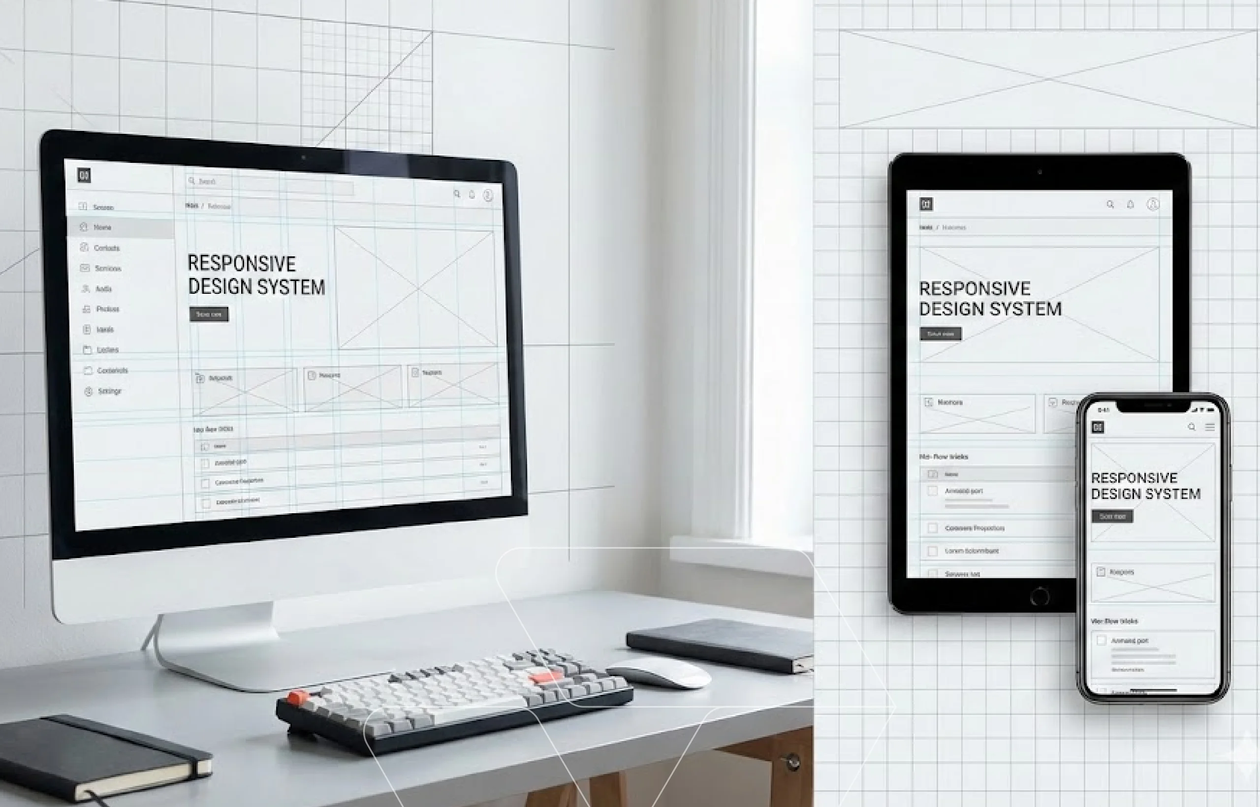
5. Responsive Design
Responsive design ensures that digital interfaces adapt across devices and screen sizes. Users expect consistent performance whether they are on a smartphone, tablet, or desktop.
A responsive layout adjusts structure and content presentation across breakpoints automatically. Typography scales for readability. Navigation transforms logically for smaller screens. Buttons remain easy to tap without accidental taps.
Responsiveness improves engagement and supports mobile-first indexing and performance signals that search engines evaluate. For a deeper look at the strategy and structure behind adaptability, explore our guide on the best way to make a website responsive.
6. Accessibility
Accessibility ensures that digital products are usable by people with different abilities. Proper color contrast helps users with visual impairments. Semantic HTML structure supports screen readers. Clear labeling improves comprehension.
Accessibility also involves interaction considerations. Buttons must be large enough to tap or click comfortably. Keyboard navigation should function correctly.
Inclusive design expands reach and improves usability for everyone.
7. Structured Navigation
Navigation defines how users move between pages and sections, enabling efficient exploration and task completion.
Clear menu categories reduce confusion. Logical page grouping improves discoverability. Search functionality helps users navigate complex platforms efficiently.
Navigation should support natural movement. When users feel lost, they leave.
8. Purposeful Layout
A purposeful layout organizes content into structured sections that create clear relationships between elements across the entire page.
Balanced spacing improves readability. Visual balance prevents one side of a page from feeling heavier than the other. Controlled content width improves scanning behavior.
Layout acts as the structural backbone of digital design.
9. Alignment
Alignment ensures elements line up within a defined grid, creating order and visual stability at a detailed level. This precision prevents visual noise and strengthens overall coherence.
Even small misalignments disrupt visual harmony and create a sense of instability. Strong alignment creates rhythm, order, and professionalism. Grid systems help maintain this precision by defining consistent spacing, margins, and column structures.
While layout organizes large sections of a page, alignment ensures every element within those sections connects cleanly and predictably.
10. Color Strategy
Color influences both perception and emotion. Strategic use of color theory ensures harmony across the interface.
Primary colors highlight calls to action. Secondary tones support content areas. Neutral backgrounds improve readability.
Color must serve function, not decoration. Strong color strategy reinforces brand identity and clarity.
11. Typography System
Typography shapes how information is consumed. Clear font hierarchy distinguishes headings from body text.
Line spacing affects readability. Font weight influences emphasis. Consistent typography systems maintain visual order.
Readable text directly improves usability and comprehension.
12. Feedback Mechanisms
Feedback confirms user actions and reduces uncertainty. When a button changes appearance after being clicked, users know the system responded.
Loading indicators, progress bars, and validation messages guide users through tasks. Micro-interactions create subtle emotional engagement.
Feedback supports smoother interaction flow.
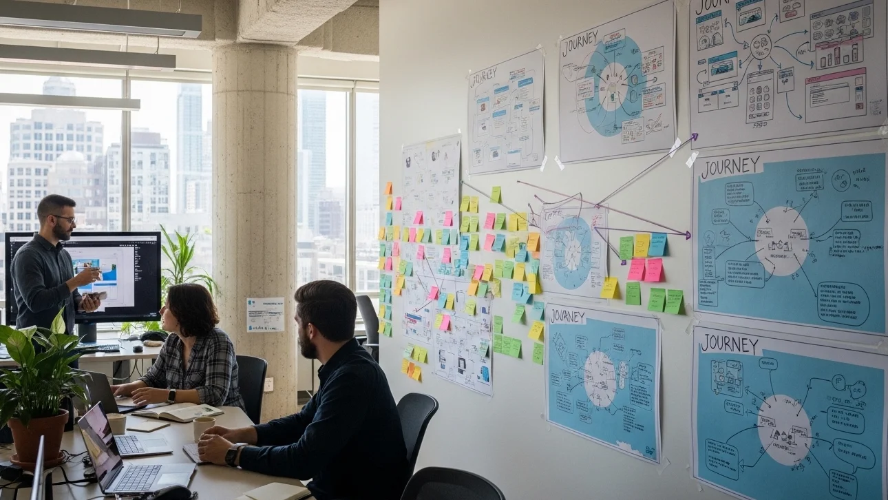
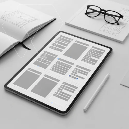
13. Iterative Design
Prototyping allows designers to test ideas before committing to full development. Early versions of a product, whether simple wireframes or interactive mockups, reveal how users move through layouts, interpret navigation, and respond to interactions.
Testing prototypes with real users uncovers confusion points, friction, and usability gaps early. Iteration based on feedback ensures the final product is refined, efficient, and aligned with user expectations.
Design improves through testing and refinement, not assumption. Prototyping makes that refinement possible.
14. User Control
Users should feel empowered, not trapped. Undo functions, editable forms, and confirmation messages prevent frustration.
Clear exit paths and cancellation options improve comfort. User control strengthens emotional trust and reduces anxiety during complex tasks.
15. Emotional Design
Emotional design goes beyond functionality. Subtle animations, smooth transitions, and thoughtful spacing create memorable experiences.
While functional design ensures usability, emotional elements build connection. Users return to platforms that feel intentional and pleasant.
Knowing these principles is one thing. Turning them into real, high-performing digital experiences requires careful execution. That’s where experienced design teams make the difference.
Why choose Web Dev Studioz for UI/UX design?
At Web Dev Studioz, our UI/UX design services are built on research, systematic processes, and measurable performance outcomes. Our goal is to create interfaces that feel intuitive while supporting real business outcomes.
Research-Driven Design Approach
Every project begins with understanding user behavior, expectations, and business objectives. We analyze how users interact with digital platforms and identify friction points early. This research shapes layout decisions, navigation structure, and interaction flow.
Instead of guessing what might work, we rely on insights. That foundation allows us to build interfaces that are both strategic and user-centered.
Structured Systems and Scalable Design
Consistency is built through organized design systems. Typography, color usage, spacing, and alignment follow a defined structure. This ensures visual balance and long-term scalability.
Design systems also make future updates easier. As businesses grow, digital products must adapt. A structured foundation prevents inconsistency and reduces redesign costs.
Performance, Accessibility, and Responsiveness
At Web Dev Studioz, usability is tested before and after launch by our experienced team. Interactive prototypes help identify gaps early. Accessibility standards are integrated to ensure inclusive experiences.
Responsive design is carefully optimized so that layout, buttons, and navigation function smoothly across devices. Performance metrics are monitored to ensure engagement continues to improve over time.
This balanced approach allows us to deliver digital experiences that are visually refined, functional, and built for sustainable growth.
Final Thoughts
Strong UI/UX design principles create digital experiences that feel intentional, intuitive, and meaningful. They combine aesthetic appeal, functional layout, accessibility, and emotional design into one cohesive system.
When the principles of UI/UX design are applied correctly, users navigate confidently and complete tasks without friction.
At Web Dev Studioz, structured design meets strategic thinking to deliver exceptional results. If you’re ready to elevate your digital presence, contact our team at Web Dev Studioz today and build an experience your users will appreciate.
Frequently Asked Questions
What are the core elements of UI/UX design?
Core elements include user research, information architecture, interaction design, visual design, usability testing, and accessibility. Together, these disciplines ensure digital products are intuitive, functional, and aligned with user expectations.
What is the difference between UI and UX?
The user interface focuses on presentation and interactive components that users directly see. User experience focuses on the complete journey, including usability, efficiency, satisfaction, and how effectively users accomplish goals.
How does user research improve design decisions?
User research uncovers behavior patterns, expectations, frustrations, and motivations. Insights from interviews, surveys, and analytics guide design direction, reduce assumptions, and ensure solutions align with real user needs.
Why is usability testing important before launch?
Usability testing identifies friction, confusion, and inefficiencies before public release. Observing real users interact with a prototype reveals hidden issues, allowing improvements that prevent costly revisions later.
How do UI/UX improvements impact business growth?
Strong design improves engagement, builds credibility, increases retention, and supports conversion goals. When users interact comfortably and confidently, businesses benefit through stronger customer relationships and measurable long-term performance improvements.
Have any Question in Mind?
Recent Blog Posts


Certified by