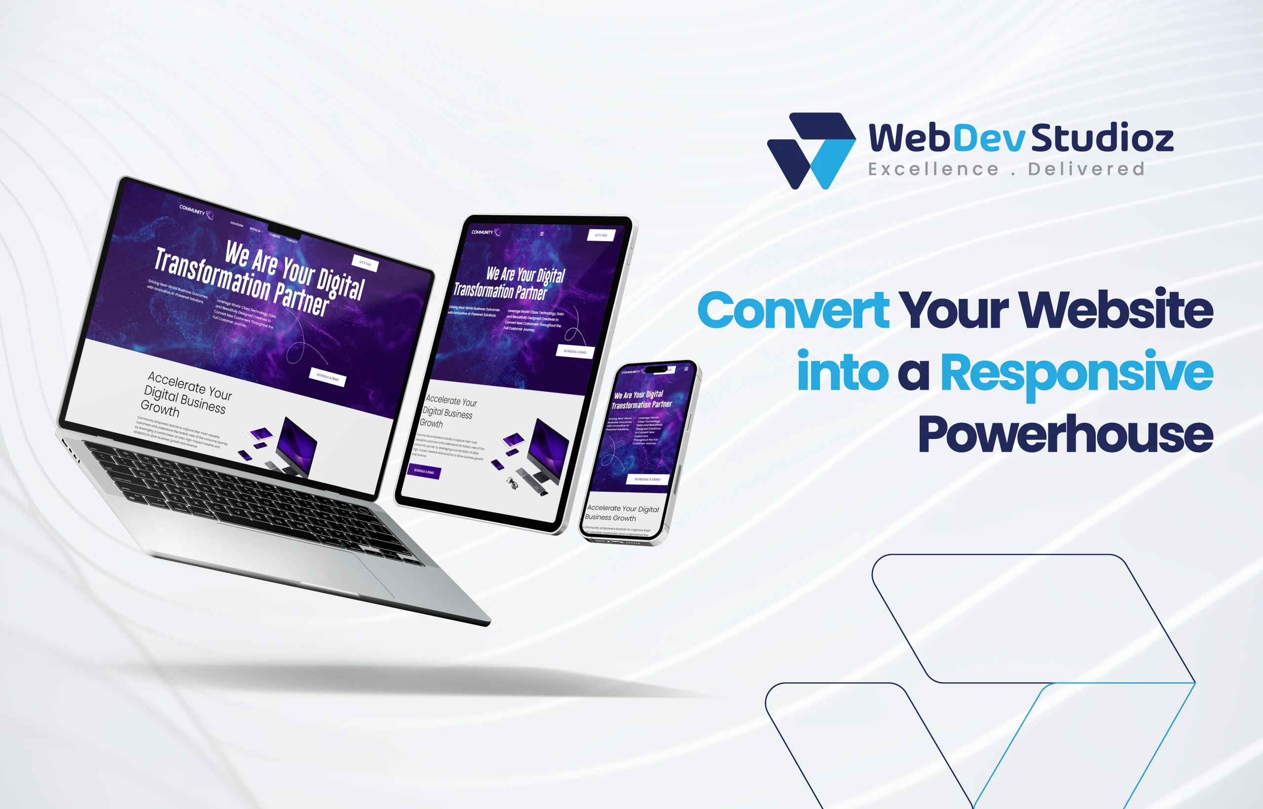
How to Convert a Normal Website into Responsive?
The internet is everywhere. People don’t just browse on desktops anymore. Phones, tablets, and even smart TVs are now common. A site that works on a desktop might break on smaller screens. If it happens, then you are really at a loss.
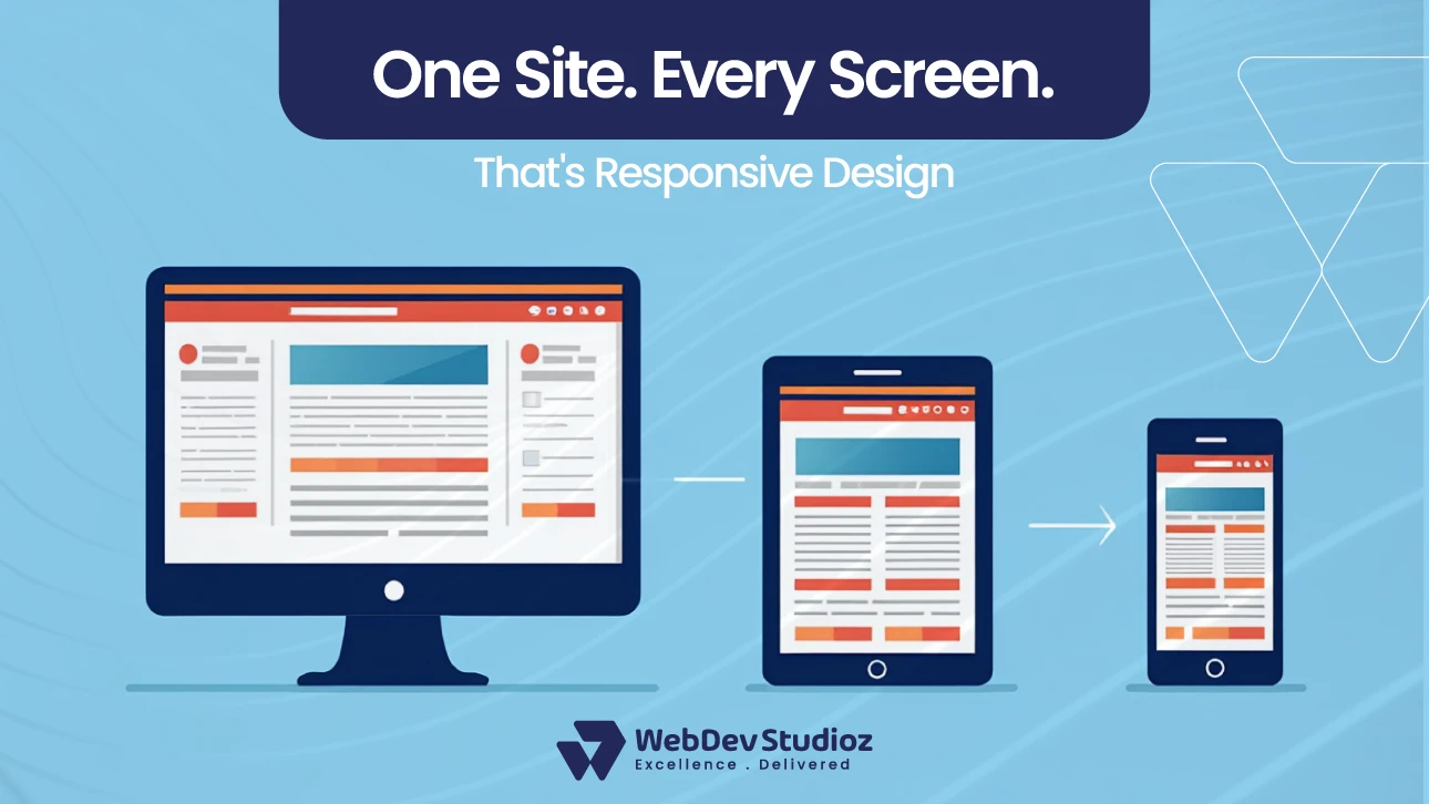
The best step is to convert a normal website into a responsive one. A responsive site adjusts on its own—text stays clear, images fit, and buttons remain easy to tap. Menus also shift neatly so visitors can scroll and read without trouble. This makes users explore more pages and engage actively.
What Does It Mean to Convert a Normal Website into a Responsive Website?
Converting a normal website into a responsive one isn’t just about changing sizes. It means redesigning it for all devices. Phones, tablets, and desktops should show the same smooth experience. Layouts, text, and images must adapt. Menus and buttons need to be touch-friendly. Responsiveness ensures content is readable everywhere. Without it, users leave quickly.
Even simple blogs or e-commerce stores lose traffic. The goal is a consistent experience. Platforms like WordPress and Shopify provide tools to help. For businesses that need expert implementation, WordPress development services can transform blogs and corporate sites, while Shopify development services ensure e-commerce stores are fully optimized for mobile shoppers. Adaptive conversion and retrofit website techniques allow updating old sites without a full rebuild. It’s essential for today’s mobile-first world.
Why Should You Upgrade Old Websites?
Old websites may look fine on desktops. But mobile users face problems. The buttons are too small. Menus break. Images don’t resize. Upgrading fixes these issues. It also improves SEO and enhances usability.
Visitors can navigate easily. Older sites may not support modern devices. Upgrading keeps them relevant. Mobile users dominate online traffic. Even small businesses see higher engagement with responsive sites. Conversion rates improve.
Convert Your Site Today
Get expert help to turn your static site into a fully responsive design.
Benefits of Upgrading Websites
| Benefit | Why It Matters |
|---|---|
| Mobile-Friendly Experience | Users navigate easily on any device. |
| SEO Boost | Search engines favor mobile-friendly sites. |
| Lower Bounce Rates | Visitors stay longer. |
| Easy Updates | Maintenance is simpler and faster. |
Steps to Redesign for Responsiveness
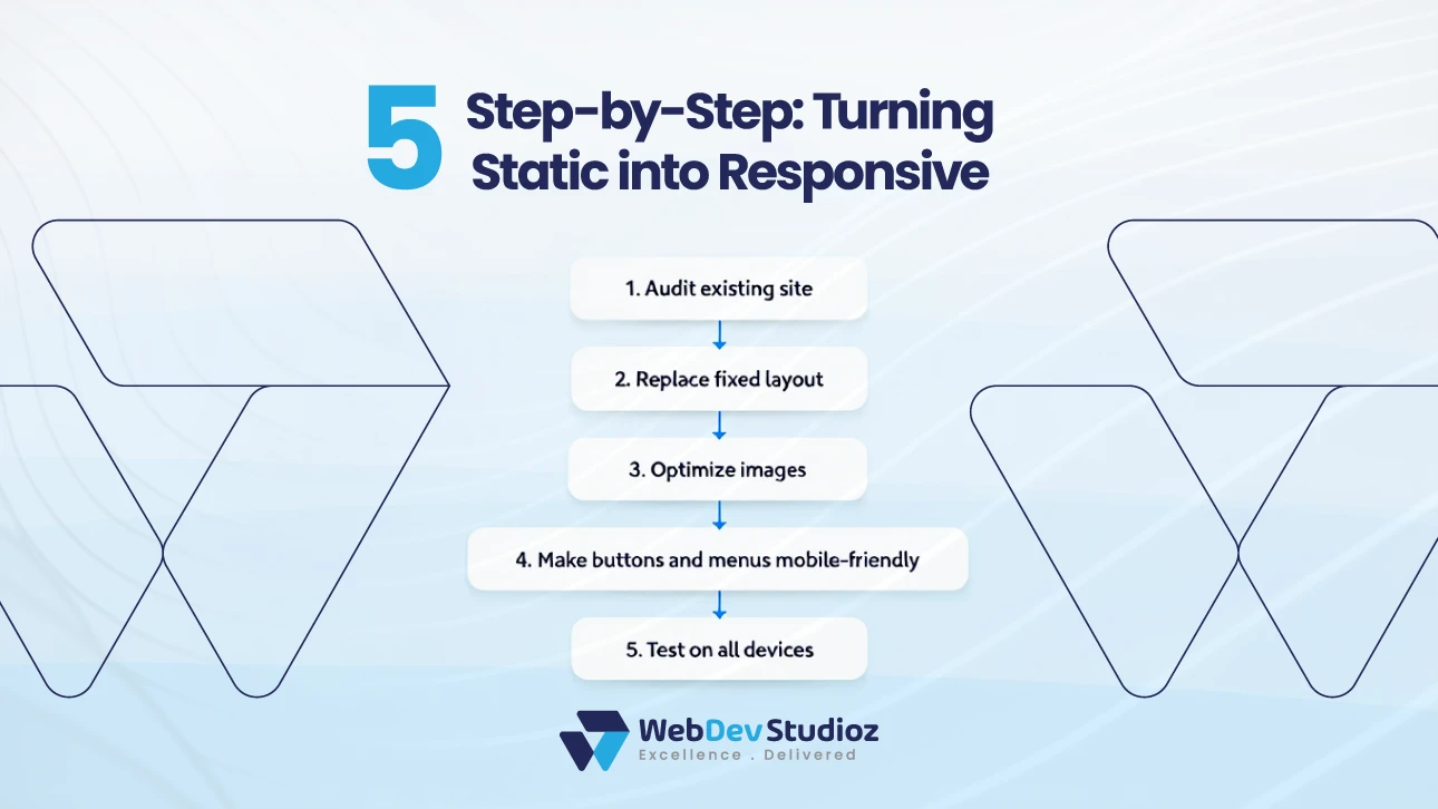
- Redesigning a site needs careful planning.
- Start with a full audit of each page.
- Review images, text, and buttons.
- Spot the parts that break on small screens.
- Use flexible layouts instead of fixed widths.
- Make sure images scale cleanly without stretching.
Update navigation so menus are simple to tap. Hamburger menus often work well on mobile. So, they should be tested on other devices such as laptops and tablets. Check every page and feature. Adjust where needed. Reading is improved when content has short paragraphs and clear headings.
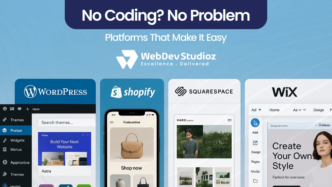
There are also ready-made templates. These are offered on different platforms like Wix and Squarespace. These steps make a site adapt smoothly.
How to Retrofit Websites Without Full Redesign
Not all sites need a full rebuild. Retrofit websites allow updates without starting over. Replace fixed-width layouts with flexible grids. Make buttons mobile-friendly. Resize images for all devices. Check interactive elements, forms, and sliders. Improve page speed for mobile. Minor CSS tweaks often help. This is ideal for older or smaller websites.
Retrofit vs Full Redesign
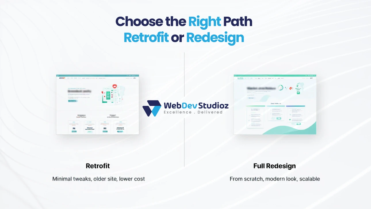
| Approach | Description | Best Use Case |
|---|---|---|
| Retrofit | Adjust the existing layout for responsiveness | Older or smaller websites |
| Full Redesign | Build a new responsive site | Outdated or complex sites |
Can You Convert a Website Without Coding?
Yes. Modern platforms allow adaptive conversion without coding. Wix has drag-and-drop editors. Mobile-optimized themes are offered at Shopify. Squarespace templates are responsive by default. WordPress plugins handle responsiveness automatically. Sometimes, there remain some minor tweaks, such as adjusting spacing or aligning text.
Therefore, testing on multiple devices is essential. Adaptive conversion saves time and avoids complex coding. Even beginners can make a site responsive. The key is choosing the right tools. Templates, apps, and plugins handle most work. This makes the process accessible to anyone.
Common Challenges You Might Face
Converting a website isn’t always smooth. Fixed elements may not resize. Large images slow loading on mobile. Forms, sliders, or custom scripts might break. Older browsers may not display features correctly. Even plugins or themes can conflict. Navigation can become confusing on smaller screens. Buttons may be too small or overlapping.
Testing across multiple devices is crucial. You may need minor coding fixes. There should be proper plans for everything, as plans avoid surprises. Break each section into short and digestible chunks. This improves readability and reduces errors. Anticipate issues before starting.
How Long Does It Take to Convert a Website?
Time depends on the site’s size. Small sites may take a few days. Medium sites, one to two weeks. Large e-commerce or custom sites, three to four weeks. Complex designs need more time than simple ones. Testing on multiple devices adds time.
Updating images, text, and interactive elements also matters. Templates can speed up the process. Minor CSS adjustments take additional time. Even with tools, thorough checking is required. Setting realistic expectations helps.
You avoid rushed work. Careful conversion ensures smooth performance. This investment pays off in user engagement and conversions.
Platform-Specific Tips
WordPress
Use responsive themes like Astra or OceanWP. Plugins like WPtouch help older sites.
Shopify
Mobile-optimized themes are essential. Test checkout flows on phones.
Squarespace
Most templates are already responsive. Adjust content blocks for smaller screens.
Wix
Mobile editors allow changes for phones without affecting desktops.
Testing is critical. Each platform has tools to check responsiveness. Even small changes improve usability. Check images, forms, menus, and buttons. Responsive design increases user satisfaction and SEO.
Tips for Maintaining Responsiveness Long-Term
Use flexible grids instead of fixed widths. Test regularly on multiple devices. Optimize images for fast loading. Keep navigation simple. Check forms and interactive elements. Update plugins and themes. Small changes over time prevent layout issues. Mobile devices evolve, so testing ensures compatibility.
Document your updates. Use analytics to monitor performance. Responsive design isn’t one-time work; it’s ongoing. Consistency matters. Visitors notice broken layouts or slow pages. A small, continuous effort maintains a smooth experience.
Common Mistakes to Avoid When Converting
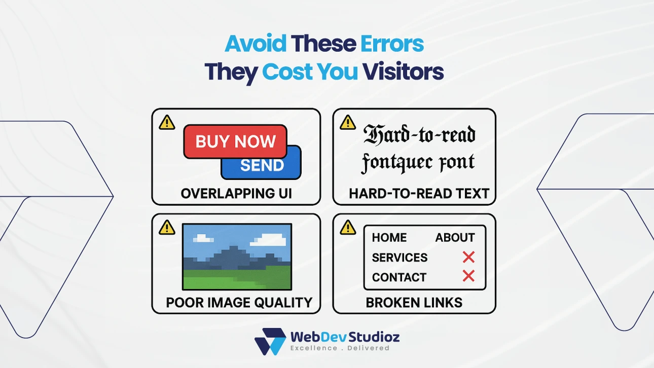
Complex layouts confuse users. Never ignore mobile users. Large, unoptimized images slow load times. Skipping device testing creates broken experiences. Not checking forms and buttons reduces conversions.
Forgetting older browsers may lose traffic. Using many add-ons slows down your site.
Failing to test updates leads to errors. Avoid assumptions; always verify on real devices. Keep content clear and navigation simple. Small mistakes make a big impact on user experience.
How Responsiveness Impacts SEO and Conversions
Google ranks the responsive websites. Mobile-first indexing rewards mobile-friendly pages. Conversion rates improve with easier navigation.
Slow, broken sites lose visitors and revenue. Use Google PageSpeed Insights to monitor website health. Analytics show engagement differences between mobile and desktop users.
Future-Proofing Your Website for New Devices
Devices are always changing—tablets, foldables, even smart TVs. That’s why design must stay flexible. Use grids, scalable images, and adaptive layouts for the best results. Update themes and plugins often, since new features can break layouts. Track analytics to spot problems on specific devices.
Stay ready for new technology as it arrives. Flexible design saves you from expensive rebuilds. Planning keeps a site usable for everyone. Even smaller brands gain an edge. A responsive website built today stays useful tomorrow.
Conclusion
To stay competitive, you must convert a normal website into a responsive one. Mobile traffic dominates. Non-responsive sites lose users fast. You can update your website by different methods, like retrofitting it and redesigning for responsiveness. Adaptive conversion of your site also works the best for the same purpose.
Platforms like WordPress, Squarespace, Wix, and Shopify make it easier to make a website responsive. Web Dev Studioz helps businesses improve websites for better SEO, usability, and conversions. Don’t wait—ensure your site works perfectly on every device today.
FAQs
- What is the difference between responsive and adaptive designs?
Responsive design adapts smoothly to different screen sizes. Adaptive sites adjust using fixed screen formats. - Do I need coding skills to convert a normal website into a responsive one?
Not always. Many platforms include responsive themes, but small CSS edits can improve the look. - Can I retrofit Wix or Shopify sites to be responsive?
Yes, both allow it. Using their tools, adjustments can be made in minutes. - How does responsiveness affect SEO?
Google favors mobile-friendly websites. These sites also lower bounce rates and attract more visitors. - Is it worth redesigning an old website for responsiveness?
Yes, it is. Updating keeps the site usable across different devices. Doing so also improves the overall performance of your website.
Recent Blog Posts


Certified by