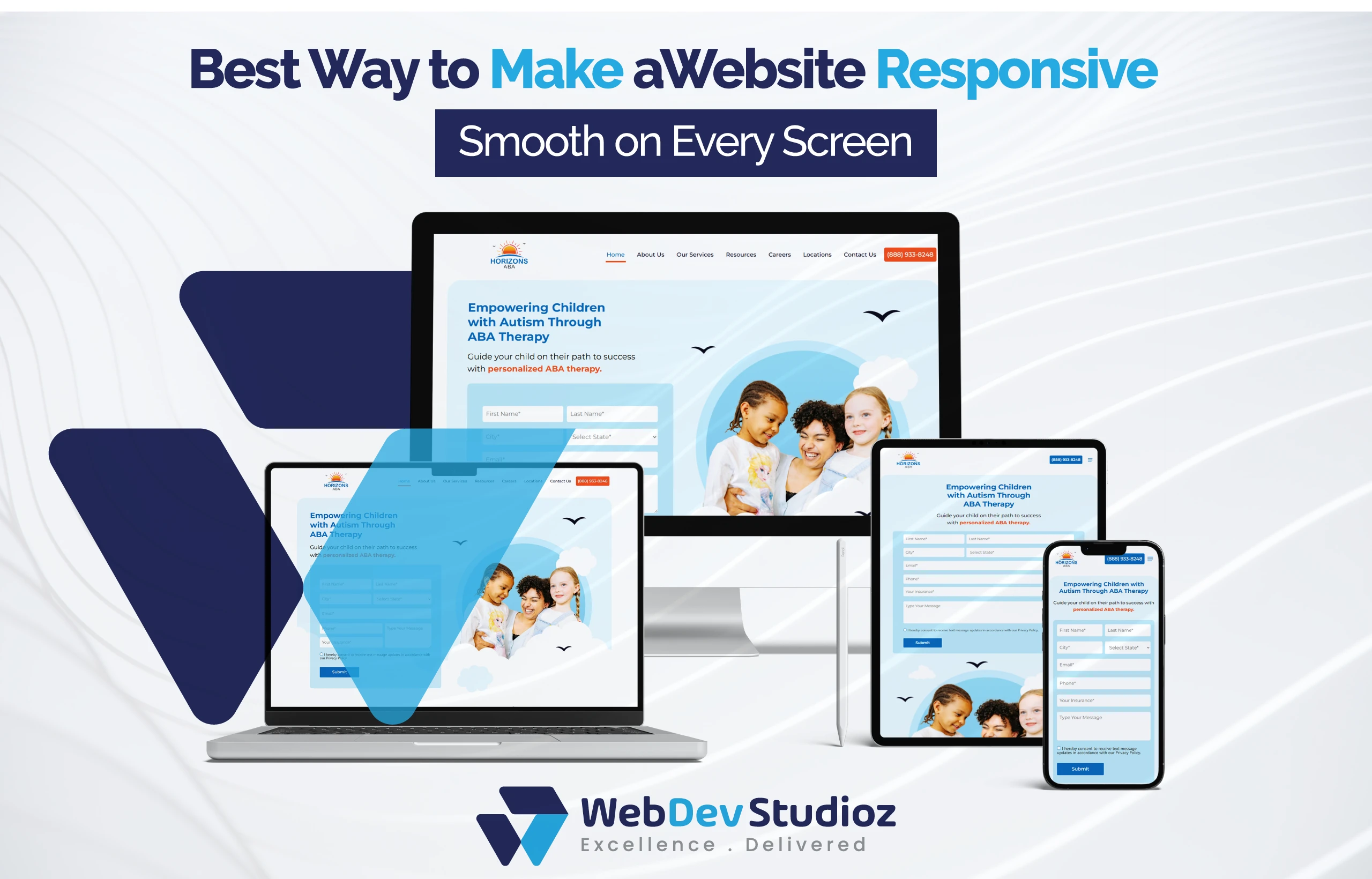
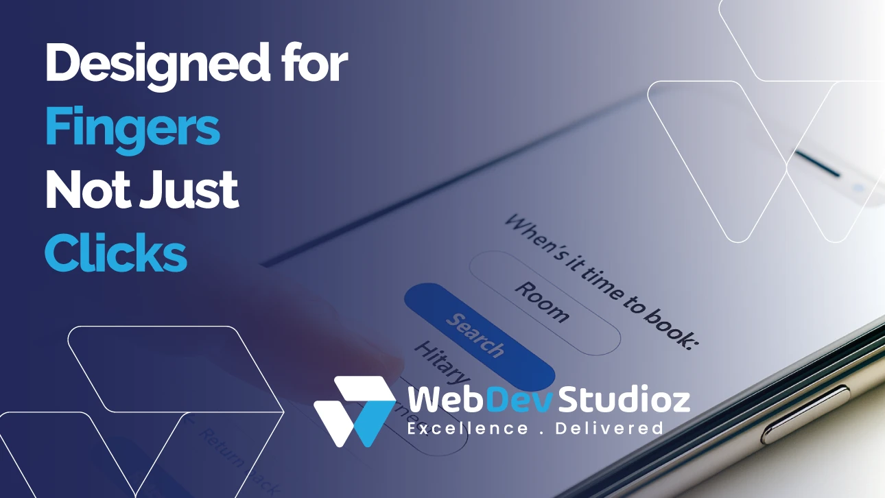
What Is the Best Way to Make a Website Responsive?
Let’s be real—people don’t just use computers anymore. Phones, tablets, laptops, and even smart TVs are also being used to explore websites. Now everyone has different tools to browse a website. So, if your website works fine on a laptop but is messy on a phone, you’re in trouble. That’s why knowing the best way to make a website responsive matters.
A responsive website isn’t something extra. It’s a necessity. It keeps visitors happy, makes your content readable everywhere, and yes—Google likes it too.
Web Dev Studioz specializes in creating responsive sites through expert WordPress development services, ensuring no weird stretching, no broken menus—just smooth layouts all around.
What Is the Best Way to Make a Website Responsive?
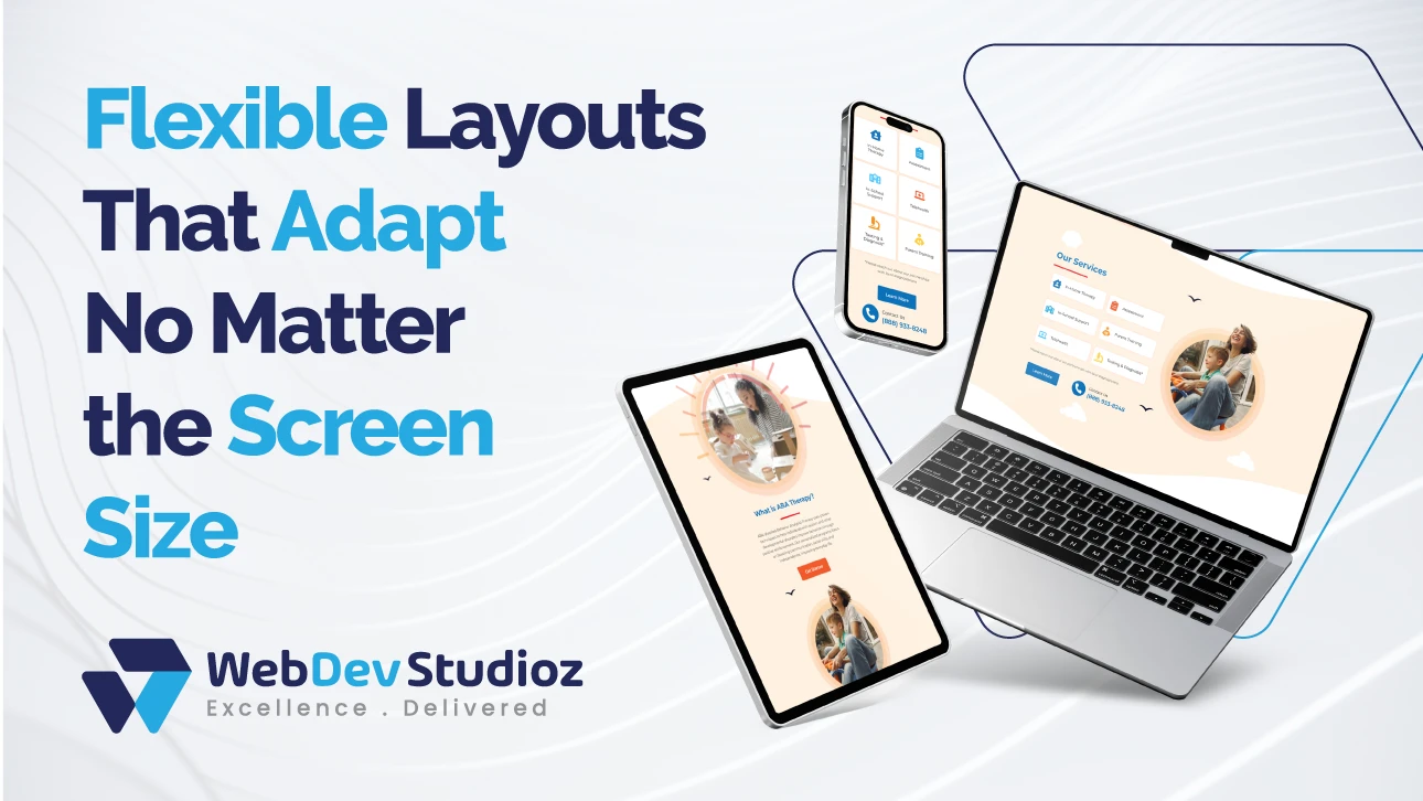
The best way to make a website responsive is more than just resizing pages. It changes how people use your site. Buttons stay easy to tap. Menus don’t feel crowded. Content is simple to read. Visitors can scroll, swipe, or click without getting frustrated.
The smoothness of your website keeps customers on your site longer. If your website is easy to use, it can also urge them to buy something. So, coding is not the only thing involved. Actually, the goal is to make everyone feel comfortable on any device.
Why User Experience Depends on Responsiveness
A responsive website isn’t just about making pages smaller or bigger. It actually changes how people use your site.
It’s more than just coding. It’s about making every visitor feel comfortable. It works on any device they have.
Make Your Website Truly Responsive
We’ll make your site responsive and user-friendly on any device.
Why Responsive Coding Matters
Responsive coding is the backbone of a website. Without it, the whole thing falls apart. Developers rely on HTML5 and CSS. Because these can create layouts that can expand or contract.
Rather than sticking to fixed pixels, they work with percentages so everything adjusts smoothly. So, your text boxes, images, and sections move naturally with the screen.
Media queries in CSS let you change styles based on the screen. Want a menu to stack instead of sitting side by side on a phone? Done. Need larger buttons for tablets? No problem. With responsive coding, your website works—everywhere.
CSS Media Queries—The Small Hero
Here’s a little secret: media queries do a ton of work quietly. They detect screen width, height, or orientation. Then, they apply styles specifically for that device.
For example, a desktop shows a horizontal menu, while a phone shows it stacked vertically. Images resize without stretching. Text wraps neatly.
A site looks messy on a phone when media queries aren’t used. Use them with fluid grids and a mobile-first approach, and the site doesn’t just resize. It feels right on any screen.
Fluid Grids—No More Broken Layouts
Ever visited a site where columns overlap on mobile? Annoying, right? That’s why fluid grids exist. Instead of fixed pixels, elements use percentages. Columns, images, content—everything scales based on screen size.
Frameworks like Bootstrap make this easy. They have pre-made grids that work almost automatically. You just plug in your content, and it adapts. It’s one of the core techniques for the best way to make a website responsive.
Mobile-First Methods—Start Small
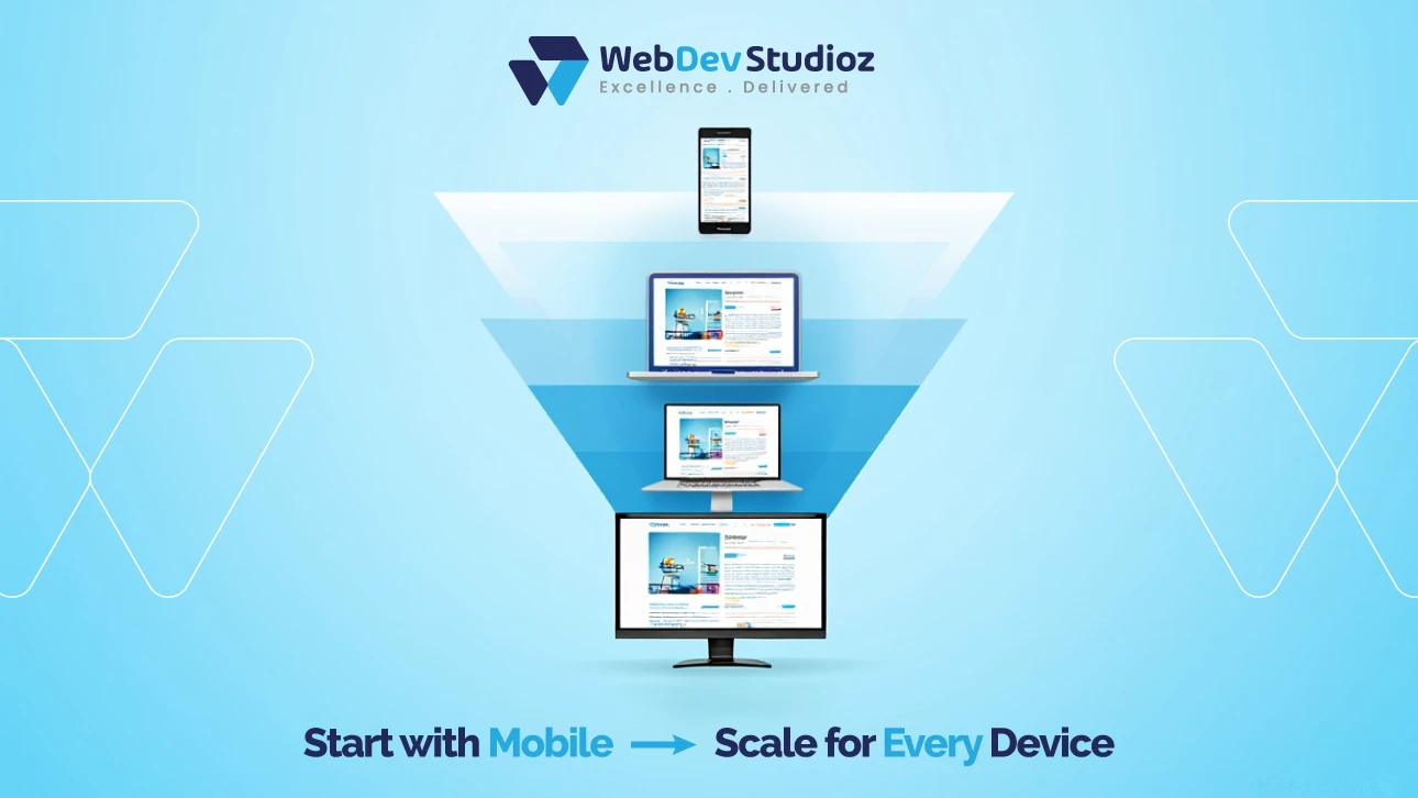
Here’s a tip many people overlook: design for mobile first. We know desktops are nice. But most users are on phones now. Mobile-first means you build for the smallest screens first.
Why? It forces you to focus on essentials: readable text, tappable buttons, and easy navigation. Then, bigger screens get more bells and whistles. This method also boosts performance, which keeps users happy and helps SEO.
HTML5—The Backbone

HTML5 is more than just new tags. The elements—<header>, <footer>, <section>—help organize how your layout looks. This makes it easier to read and manage.
HTML5 also handles videos, audio, and other interactive features well. Implement it with CSS, Bootstrap, and a mobile-first strategy.
Then your website can adjust across devices without breaking. Users get a smooth experience every time.
Bootstrap—The Developer’s Shortcut
A kind of shortcut for creating responsive websites is Bootstrap. It includes pre-made forms, buttons, menus, and grids. These things are ready to be customized for various screen sizes. Clean, adaptable websites can be rapidly created by even beginners.
Since it has CSS media queries and fluid grids built in, there’s less manual coding and fewer headaches. Used correctly, it saves a ton of time and keeps your site looking consistent across devices.
Quick Look at Responsive Techniques
| Technique | What It Does | Why It Helps |
|---|---|---|
| Fluid Grids | Scales layout with percentages | No more broken columns |
| CSS Media Queries | Adapts styles for device screens | Keeps text and images readable |
| Mobile-First Design | Start designing for small screens first | Focuses on essential content |
| Bootstrap Framework | Pre-built responsive components | Speeds development and keeps things tidy |
Common Mistakes to Avoid
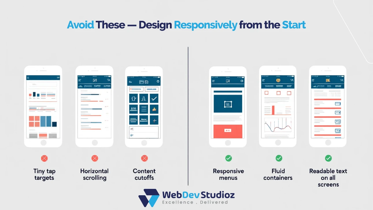
Even pros mess up sometimes. Here’s what to watch out for:
- Elements with a fixed width that won’t adjust.
- Ignoring small screens during planning.
- Huge images that slow down mobile load.
- Not checking how it works on different devices.
Little errors like these can tank a site’s usability. Testing matters, and Web Dev Studioz makes sure every site works flawlessly before launch.
How to Do It
Step by step, here’s how to make a site responsive:
- Sketch a layout plan. Think about columns, menus, and images.
- Use fluid grids to make content flexible.
- Includes CSS media queries for various screen sizes.
- Start with mobile first, then scale up.
- For speed, use frameworks like Bootstrap.
- Test on phones, tablets, desktops, and even TVs.
If that sounds overwhelming, you can lean on responsive web services from Web Dev Studioz. They handle the techy stuff so you can focus on your content.
Benefits of Responsive Sites
| Benefit | Why It Matters |
|---|---|
| Better User Experience | Easier to navigate anywhere |
| Faster Load Times | Optimized images and layouts |
| SEO Boost | Google prefers mobile-friendly sites |
| Cost-Efficient | One site works on all devices |
Conclusion
Well, in the end, the best way to make a website responsive is really just to mix a few things. You’ve got CSS media queries, fluid grids, and a mobile-first approach. They all help the site fit on any screen. HTML5 and Bootstrap make it easier. And they save a ton of headaches, too.
If a business wants a site that works without stress, Web Dev Studioz can handle that. They make sure your site looks good. It runs well everywhere and keeps people coming back.
Because, honestly, if your site looks messy on a phone, most visitors will just leave.
FAQs
- Does responsive design help SEO?
Definitely. Sites that work well on mobile rank better, load quickly, and reduce bounce rates. - Can I go responsive without Bootstrap?
Yes. CSS media queries, fluid grids, and HTML5 can handle it all manually. - What’s the difference between responsive and adaptive?
Responsive flows naturally across screens. Adaptive uses fixed layouts for specific devices. - How long does it take?
It depends. Simple projects take a few days, complex ones a few weeks. - Mobile-first or desktop-first?
Mobile-first. Most users visit from phones, and it improves UX.
Recent Blog Posts


Certified by