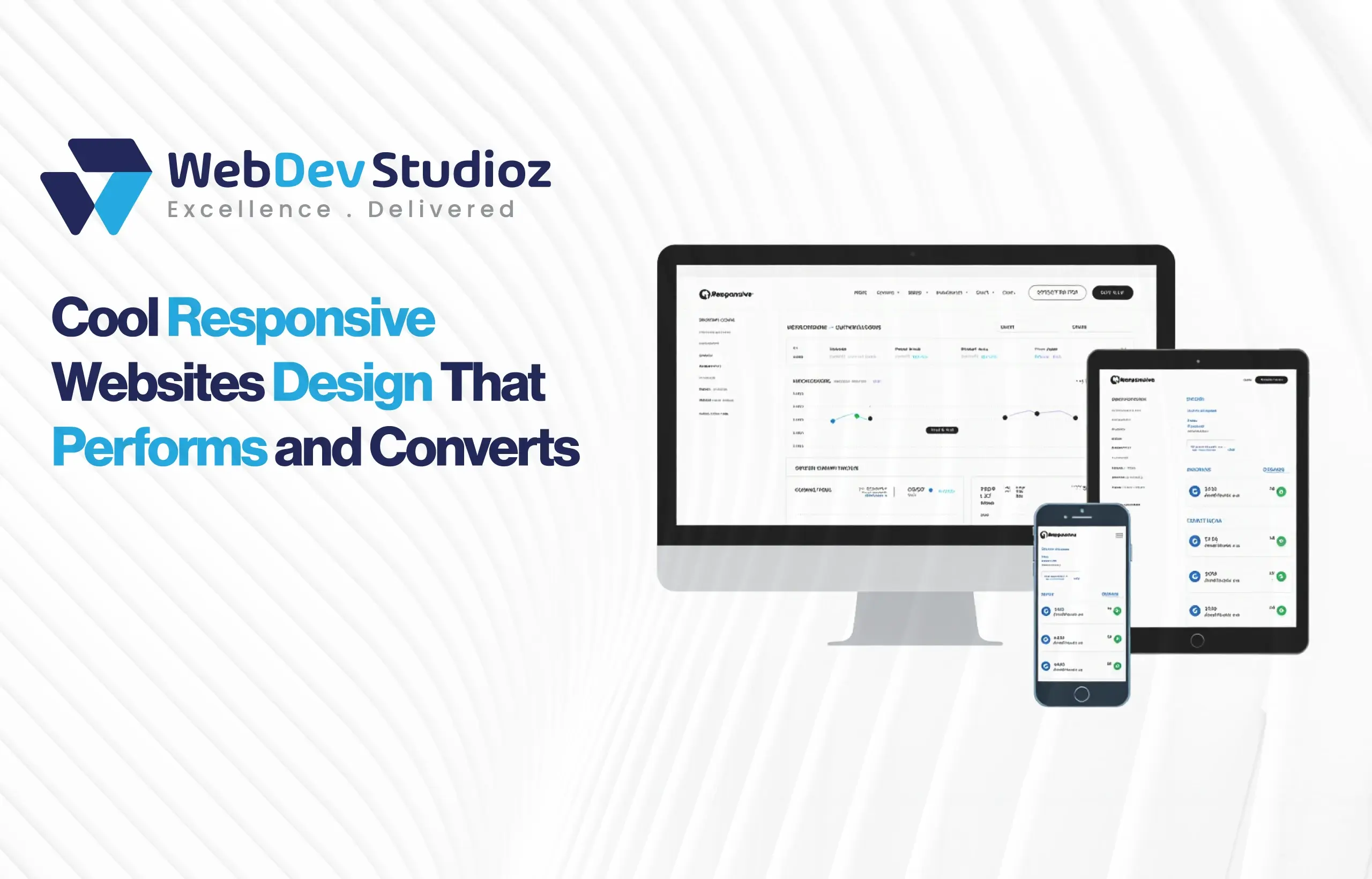
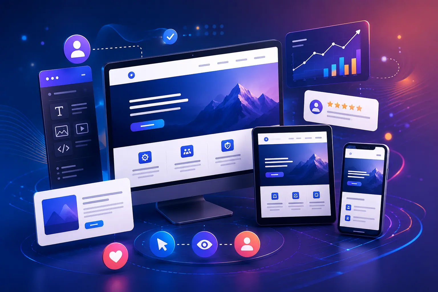
What Do Cool Responsive Websites Teach Businesses About Design?
Cool responsive websites show companies how to turn flexible design into business outcomes. They demonstrate how layouts, type, and media can adapt across screens while keeping brand voice intact. For teams that study these examples, the lessons are practical: fewer layout bugs, clearer calls to action, and smoother mobile paths to purchase.
In short, the best responsive sites teach how design and performance together increase trust and conversions. Behind every polished site, though, is a careful balance of design, development, and budget. The process of making a site both flexible and high-performing takes planning, not just good visuals. Factors like page count, content setup, and integrations all play a role in shaping the final price.
That’s why understanding the real responsive website development cost in 2026 matters for any business planning ahead—and why many teams turn to professional WordPress development services to get the right mix of flexibility, performance, and cost control.
How do cool responsive websites teach businesses about design?
Cool responsive websites teach that design should serve real user goals first, then look great. These examples demonstrate principles—mobile-first thinking, measured motion, and readable typography—that move metrics as well as hearts.
They make clear that a beautiful layout means little if the pages load slowly or navigation confuses users.
Ready to Build a Responsive Site
Cool websites don’t just look good—they perform. Let’s turn design inspiration into measurable results for your business.
Why responsive inspiration matters in practice
When teams look for responsive inspiration, they are not simply collecting pretty screenshots. They look at practical problems: small-screen menus, fast-resizing images, and CTAs that remain visible without overlap.
This practical lens helps product owners prioritize fixes that move the needle rather than chasing fleeting trends.
Key principles shown by award-winning designs
Studying award-winning designs reveals repeatable moves that work across industries. Those designs often balance hierarchy and whitespace so information reaches the eye in a helpful order, not a parade.
They also use motion to clarify interactions instead of distracting from content. Companies that borrow these core ideas can adapt them to brand needs without copying the visual style outright.
How modern layouts help users and teams
Modern layouts rely on systems—grids, flexible modules, and consistent spacing—that scale across pages. When a design system exists, teams ship faster and make fewer mistakes. For visitors, the payoff is predictable reading rhythms and clear next steps, which lowers friction and improves conversion. In practice, a system-driven approach prevents one-off fixes that later become technical debt.
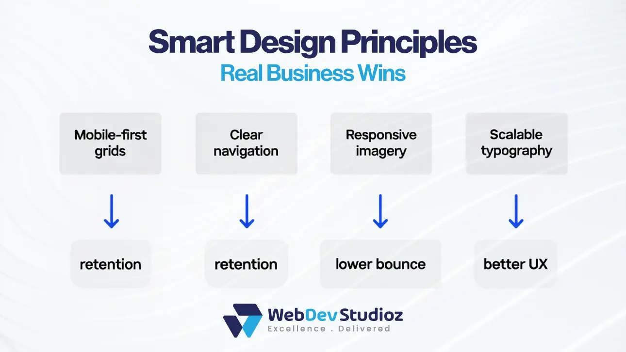
Design traits and business impact
| Trait (simple) | What it fixes for users | Business impact |
|---|---|---|
| Mobile-first grids | Prevents pinch-and-zoom frustration | Higher mobile retention |
| Scalable typography | Improves readability on all devices | Longer session times |
| Responsive images | Cuts load time on slow networks | Better search and conversions |
| Clear navigation | Reduces confusion and dead ends | More goal completions |
Where to find real, instructive examples

Practical inspiration lives on curated platforms and portfolios where designers include notes and case details. On sites like Awwwards, you’ll find examples that balance style with performance. Using Behance, teams can read case studies showing decisions and trade-offs. Some users also prefer Dribbble, where visual sketches often hint at where design patterns may go next. Each source provides a different angle: polish, process, and trends, respectively.
Applying the best responsive website examples without copying
A smart approach is to extract the principle, not the pixels. For example, if an e-commerce hero uses a heavy autoplay video, the lesson might be “use motion to show product use,” not “use the same video.”
Adapting the idea to the brand’s content and constraints keeps the outcome authentic and sustainable. This rule limits rework and avoids overloading low-end devices.
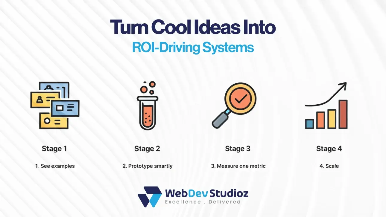
From example to execution: quick experiments
| Step | Effort (S/M/L) | What to measure |
|---|---|---|
| Prototype mobile header | S | LCP and navigation success |
| Swap the full hero image for a lean, optimized set | S | Improve load time, decrease bounce rate |
| Add a sticky CTA on checkout | M | Add-to-cart / conversion |
| Test reduced animation options | M | Interaction clarity, CPU usage |
Small experiments that reveal huge gains
Great teams run focused tests rather than wholesale redesigns. A week of prototyping shows whether a sticky CTA drives clicks or smaller images with lower drop-off. These small bets limit risk and provide concrete data to justify larger investments. Tiny gains collected over time bring large revenue benefits.
Practical notes on website development cost planning
When a team moves from inspiration to scope, cost planning matters. Understanding website development cost helps owners decide which experiments to fund and which to defer.
A clear budget plan that ties features to expected gains prevents scope creep and keeps the project aligned with business goals.
Performance and accessibility are not optional.
Cool responsive sites bake accessibility and speed into their plans from day one. Semantic HTML, focus states, and meaningful alt text help all users and reduce support issues.
Optimizing images and deferring non-critical scripts keeps the experience fast on constrained networks. These practices protect reputation and search visibility at a low ongoing cost.
Common traps and how to avoid them
Even celebrated examples can mislead. Heavy interaction layers that look great on a high-end laptop may break on modest phones. Overstuffed homepages bury value and increase load time.
The fix is simple: test on real devices and prioritize the content that delivers business value. Designers who plan for constraints create work that scales.
How teams measure impact (metrics matter)
A strong pattern ties changes to a single metric. For content pages, it might be scroll depth or time on page. This focus on measurement keeps ideas tied to real results. Teams should set a hypothesis, run the change, and measure before expanding. This focus on metrics keeps creativity aligned with results.
When to bring in outside expertise

Some projects require deep front-end skills or integration work that in-house teams cannot complete quickly. At that point, external partners can translate curated ideas into robust components and safe migrations. In those cases, a partner reduces rework and ensures the design performs in production, not just in a mockup.
Web Dev Studioz often supports businesses at this stage, helping them move from inspiration to live systems without losing speed, quality, or brand consistency.
Second bolded anchor placement for budget conversations
Teams that have tested ideas and seen early wins can better judge larger investments. Putting the website development cost conversation in two places—the planning phase and the budget review—keeps stakeholders aligned. That simple step prevents surprises at launch and helps prioritize the highest-return work.
Conclusion
Cool responsive websites teach that great design is useful before it is beautiful. They show how modern layouts, careful performance work, and small, measurable experiments move business metrics. Teams that learn these lessons plan mindful experiments, measure outcomes, and invest where returns are clear. When a brand is ready to convert curated ideas into reliable production, working with an expert partner makes the project quicker and safer.
Web Dev Studioz helps teams turn inspiration into systems that scale, balancing creativity with realistic website development cost and measurable outcomes.
FAQs
1) What exactly makes a responsive website “cool”?
A cool responsive site combines helpful performance with polished presentation. It adapts smoothly, loads quickly, and uses small interactions to guide rather than confuse.
2) Where do teams find reliable responsive inspiration?
Designers often consult curated platforms—case galleries for polish, portfolios for process, and community previews for emerging ideas. Those three views together form a practical study set.
3) How can businesses test ideas without a full redesign?
Run focused prototypes: a header tweak, an image optimization, or a sticky CTA. Measure one metric tied to that change and expand only if the data supports it.
4) Do award-level designs always perform well for commerce sites?
Not always. Some award pieces prioritize craft over constraint. The lesson is to translate the idea to the site’s audience and tech limits, not to clone the interaction wholesale.
5) When should companies hire help to implement responsive patterns?
When experiments show impact but internal capacity is limited, outside experts speed delivery and reduce the chance of costly rework.
Recent Blog Posts


Certified by