Which Framework Is Commonly Used for Responsive Web Design?
A modern site must look right on every screen. That is why teams lean on a framework for responsive web design. A framework for responsive web design reduces build time, maintains consistent layouts, and enables pages to adjust smoothly on phones, tablets, and large monitors.
This guide shows what “most used” really means, how to choose with confidence, and when skipping a framework makes sense. It also compares the leading options with clear, simple tables and ends with FAQs people actually ask. If you’re exploring frameworks as part of larger WordPress development services, the same principles apply—choose tools that fit your goals, not just what’s trending.
Which framework for responsive web design is used most today?
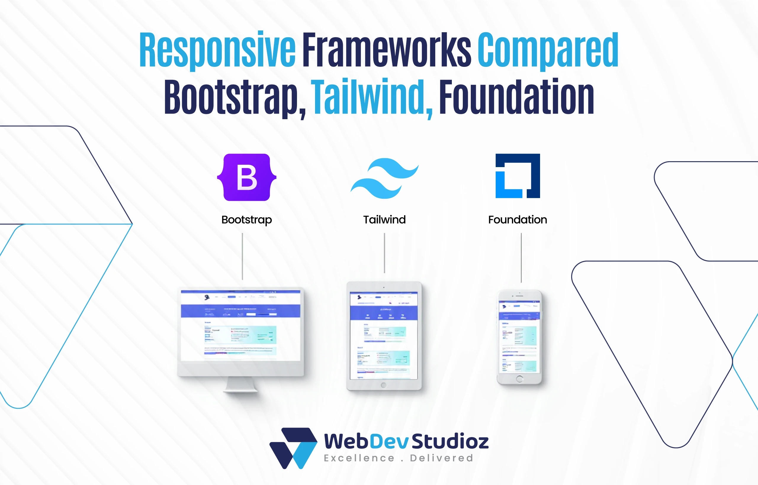
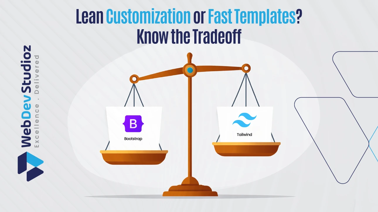
When it comes to picking a framework for responsive web design, there isn’t a one-size answer. Bootstrap is everywhere. There are different reasons for it, mostly because it’s fast, steady, and packed with components people already know. Tailwind CSS feels different—it’s lighter, gives more control, and has been catching on quickly.
Foundation hasn’t disappeared either; big teams often stick with it since it covers accessibility and works well at scale. Honestly, the best call depends on what the project is about, the limits in place, and how skilled the team really is.
Build Smarter, Launch Faster
One-Line Description: Turn framework debates into working interfaces—our team aligns your goals with the right tools and delivers production-ready results.
Why “most used” doesn’t always mean best
Market share helps, but it does not finish the story. A team building a unique brand system may favor a utility-first approach. A regulated project may need baked-in accessibility patterns. If a startup is rushing, a prebuilt UI kit can help. The winner is the framework that best fits the job, not the one that trends the most.
How do you evaluate the best choice?
A framework should remove friction, not add it. Use these simple checks.
First, match the design need. If the site must look custom, a utility-first method allows tight control over spacing, color, and states. If the look is conventional, a component kit can deliver polished results in a day.
Second, weigh performance. Some stylesheets ship with features you may never use. Using purge tools in lighter builds trims CSS bloat. In practice, smarter build steps often matter more than the framework name on the box.
Third, check the workflow. Good docs, healthy communities, and stable APIs save many hours. Teams learn faster when class names are predictable and examples are clear.
Finally, look at layout power. Native CSS Grid and Flexbox now handle complex patterns without hacks. The best frameworks embrace these modern tools instead of fighting them.
What makes Bootstrap still so common?
Bootstrap won trust by being dependable. Its grid is mobile-first. Its components (navbars, modals, tabs, alerts) solve real problems without extra code. A large ecosystem of themes, snippets, and tutorials makes onboarding easy for new developers and handoffs smooth for busy teams.
It also plays well with design systems. Variables, maps, and utility APIs let teams tune tokens such as color and spacing without breaking core behavior. That balance—speed now, flexibility later—explains why so many organizations keep choosing it.
Why are developers flocking to Tailwind CSS?
Tailwind CSS flips the script. Instead of shipping pre-styled widgets, it delivers small utility classes, such as p-4, gap-6, and md: grid. This gives precise control in the markup and removes a lot of custom CSS. The payoff is lean production bundles when unused utilities are purged.
Many designers like that Tailwind works much like a design system. Tokens live in a config file. Changes to spacing or color propagate across the project. For teams that want a unique look with clean constraints, that is powerful.
Where does the Foundation framework fit?
Foundation puts accessibility at the center. ARIA patterns, keyboard navigation, and robust form styles are first-class parts of the kit. For public sector, healthcare, and enterprise dashboards, those defaults reduce risk and review time. Not as widely used as the other two, but still reliable when inclusive UX is required.
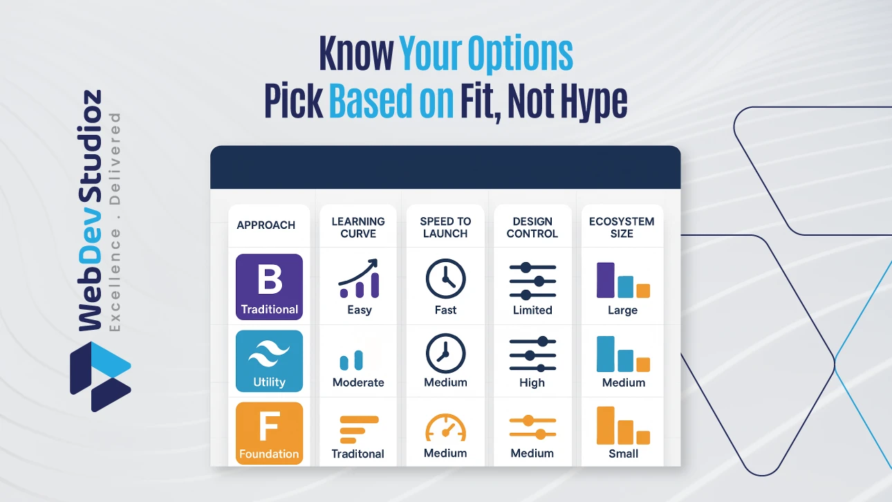
Core comparison of leading responsive frameworks
| Framework | Approach | Learning Curve | Speed to First Page | Custom Design Control | Ecosystem Size |
|---|---|---|---|---|---|
| Bootstrap | Component kit + utilities | Easy for beginners | Very fast | Moderate (via variables/utilities) | Very large |
| Tailwind CSS | Utility-first | Moderate once understood | Fast performance after setup | Strong token-driven design | Growing adoption |
| Foundation | Component kit with A11y focus | Moderate | Fast | High (enterprise-ready) | Smaller but steady |
If the team needs a safe, familiar start, Bootstrap works. If the goal is a crafted look and lean CSS, Tailwind CSS shines.
Do teams still need “responsive CSS libraries” now that modern CSS is strong?
Yes, but use them on purpose. Modern CSS handles complex grids and fluid spacing well. A framework adds two things: speed and consistency. It gives the team a shared language and predictable behavior across screens.
That does not mean a framework is always required. Small sites or highly bespoke art pieces may be better with hand-rolled styles. For many products, though, a steady base helps deliver features faster without layout surprises.
Choose by project scenario
To make this more practical, here are common project scenarios and the framework that fits each best.
| Project Scenario | Priority | Best Fit | Why It Fits |
|---|---|---|---|
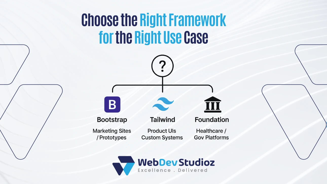
| Marketing site with a tight deadline | Time-to-launch | Bootstrap | Pre-styled components and grid speed up delivery. |
| Product UI with a unique brand system | Custom look + performance | Tailwind CSS | Utility classes map to tokens; purge keeps CSS small. |
| Government or healthcare portal | Accessibility + stability | Foundation | Inclusive patterns and robust forms out of the box. |
| Prototype to validate an idea | Speed + change | Bootstrap | Ship UI fast; refine later with themes or utilities. |
| Design system built from scratch | Tokens ensure consistency | Tailwind CSS | Config-first reflects design tokens cleanly. |
Avoid these common mistakes
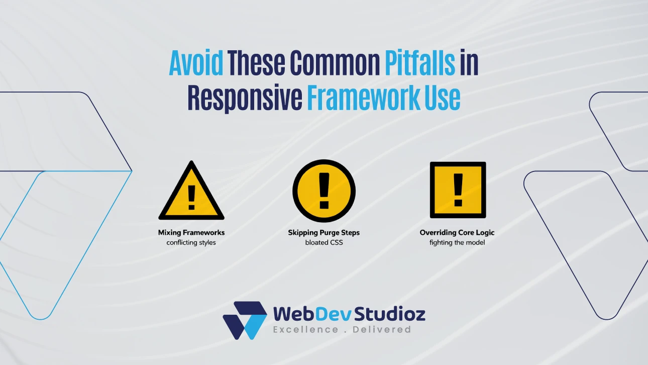
One common mistake is mixing multiple big frameworks in one app. That bloats CSS and creates clashing resets. Pick one core approach and extend it with small, focused addons.
Another mistake is skipping the build step. Shipping every utility and component to production adds weight. Set up purging and minification on day one.
Last, do not fight the framework. Embrace its mental model. Use grid utilities for layout, not margins for hacks. Keep overrides small and local.
For a deeper, step-by-step primer, see three basic responsive designs for patterns that work across any toolset.
Micro-guide: mapping layout to modern CSS
Use Flexbox for one-dimensional alignment like navbars, button groups, and media objects. Switch to CSS Grid for two-dimensional layouts like dashboards, galleries, and complex landing pages.
Good frameworks make these choices easy by exposing straightforward classes that map to the underlying CSS.
Conclusion
The most commonly used framework for responsive web design is Bootstrap, but “most common” is not the same as “best for your project.” Tailwind CSS leads when design control and lean production bundles matter. The Foundation framework stands out when accessibility drives the roadmap. Choose by goals, not popularity, and test on real devices before launch.
When a team wants a clear plan—from evaluation to build—Web Dev Studioz delivers. The studio maps goals to tools, sets up tidy build pipelines, and ships interfaces that scale. For a dependable, modern outcome grounded in a framework for responsive web design best practices, partner with Web Dev Studioz and move from discussion to delivery with confidence.
FAQs
Which framework is best for responsive design overall?
There is no single winner for every project. But Bootstrap is the most common starting point, Tailwind CSS offers the most design control, and Foundation leads when accessibility is the top priority. The best pick depends on deadlines, skill sets, and brand needs.
Is Bootstrap still relevant for responsive sites in 2026?
Yes. It remains widely used because its grid, components, and docs make teams productive quickly. It also adapts well to custom design systems.
Is Tailwind CSS better than Bootstrap for page speed?
Often, yes—when purge is configured. Tailwind CSS removes unused utilities, which keeps production CSS slim. Bootstrap can be lean too if you import only what you need and tree-shake correctly.
Do I need a framework if I already use CSS Grid and Flexbox?
Not always. If the project is small and the team is comfortable with modern CSS, then hand-crafted styles can be enough.
Which framework is best for accessibility?
The foundation is strong here because inclusive patterns are built in. That said, any framework can meet high accessibility standards if the team follows semantics, color contrast, focus states, and keyboard support with care.
Have any Question in Mind?
Recent Blog Posts


Certified by