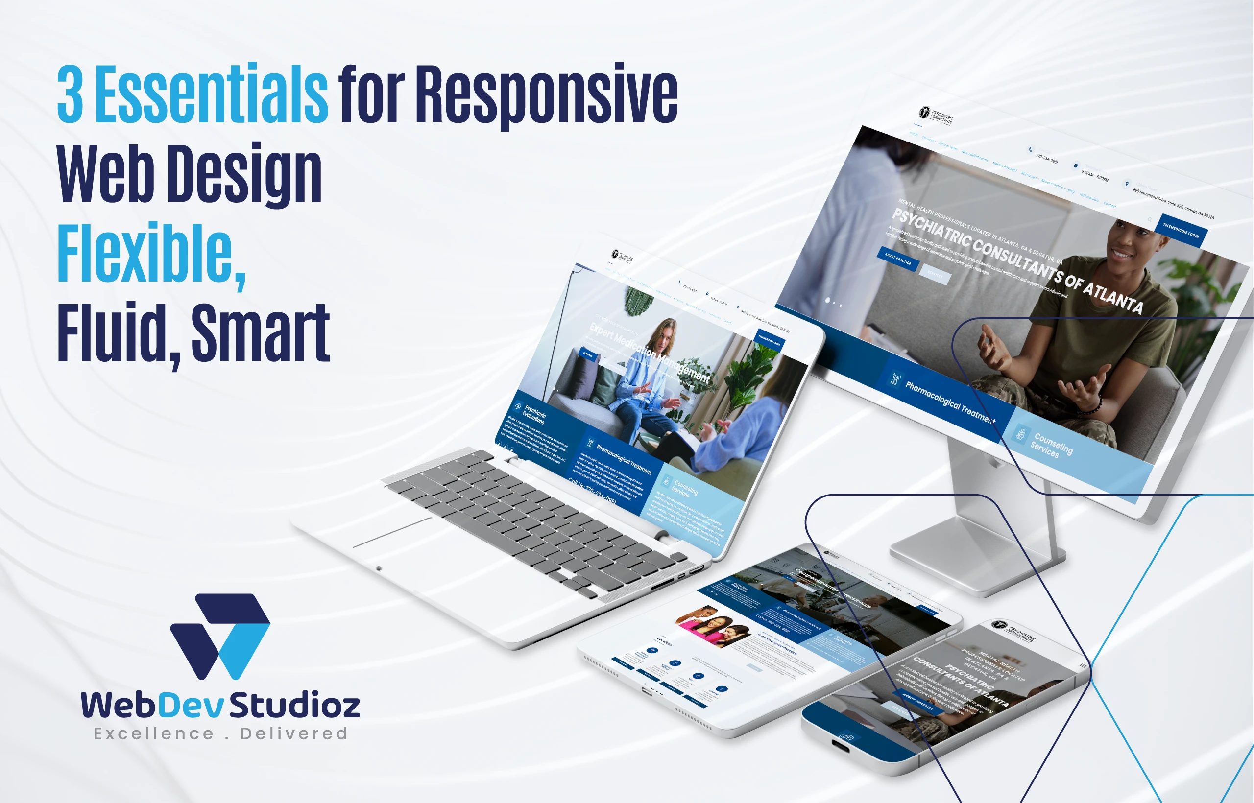
What Are the Three Basic Things Required for Responsive Web Design?
Every screen is different. Phones, tablets, laptops, and desktops are all now used for browsing. That is why the basic things required for responsive web design matter so much. They keep layouts clean, readable, and fast on any device, without building a separate site for each screen. If you’re upgrading or scaling a site, pairing responsive design with professional WordPress development services can make the transition smoother and future-proof.
What are the basic things required for responsive web design?
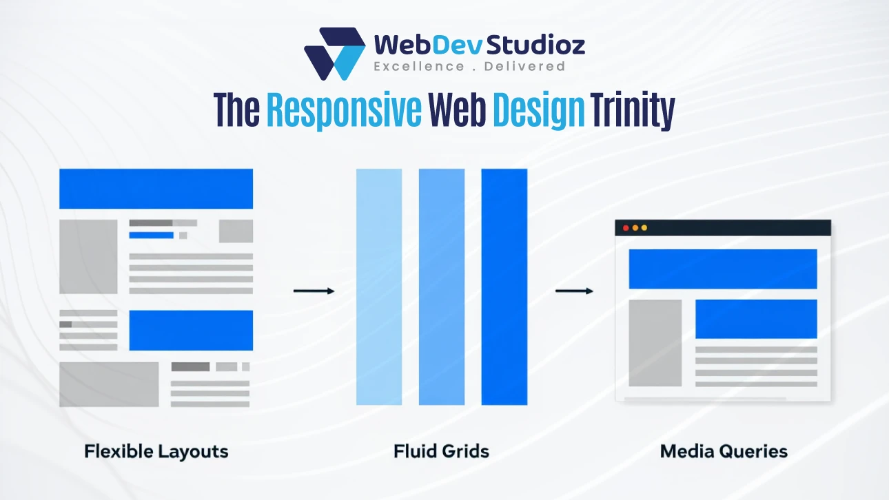
The basic things required for responsive web design are flexible layouts, fluid grids, and media queries. Together, they let a page shift with the viewport, preserve proportion, and apply smart rules. In simple terms, the layout adapts, the math scales, and the styles switch when needed.
In practice, flexible layouts prevent cramped designs, fluid grids keep spacing in balance, and media queries handle the fine-tuning. These three responsive essentials form the stable base of modern front-end work.
Why these three matter right now

Visitors judge a site in seconds. If the text is tiny or buttons overlap, they leave. These three core pillars reduce that friction. They help pages load cleanly, scale gracefully, and feel consistent across devices.
There is also a search angle. Mobile usability affects visibility. A site that reads well on small screens can hold attention longer. Engagement sends better signals.
Make Your Site Responsive Today
Our team can upgrade your website without the headaches.
The three essentials at a glance (with the right tools)
| Element | What it solves | Best used for | Helpful CSS tools |
|---|---|---|---|
| Flexible layouts | Prevents cramped or broken sections on small screens | Content blocks, image wrappers, cards | flexbox for alignment and spacing; CSS Grid for structured areas |
| Fluid grids | Keeps proportions steady as width changes | Columns, sidebars, galleries | Percentage widths, fr units, minmax() in CSS Grid |
| Media queries | Switches styles at key breakpoints | Typography, navigation, layout shifts | @media rules; mobile-first CSS; utility classes in Bootstrap |
Flexible layout
A flexible layout uses relative units. It leans on percentages, rem, and modern layout systems. It avoids rigid pixel cages.
Flexbox shines for small groups of items. It aligns, wraps, and spaces elements with minimal code. CSS Grid is better for full-page structures. It defines rows, columns, and areas with accuracy yet still responds to the viewport.
Images should scale too. Set media to max-width. That single rule saves many mobile layouts.
Fluid grids
A fluid grid respects proportion. It trades fixed column widths for scalable ones. As the screen grows or shrinks, columns follow along. Gutters and padding can scale as well.
In CSS Grid, the fr unit divides space without hard caps. minmax() prevents items from shrinking too small. This keeps content readable.
Frameworks help as well. Bootstrap ships with a proven, responsive grid. It speeds up builds and makes patterns repeatable across pages.
Media queries
Media queries make targeted changes at set widths. They let a design stay simple, then add complexity only when space allows.
With a mobile-first strategy, the smallest screens are used first. It adds rules for viewports that are wider (min-width). This keeps CSS lighter and easier to reason about.
Breakpoint cheat sheet
| Common breakpoint | Typical width | Media query snippet | What usually changes |
|---|---|---|---|
| Small phones | 320–479px | @media (max-width: 479px){...} |
Stack columns, enlarge tap targets |
| Phones | 480–767px | @media (min-width: 480px){...} |
Tighten spacing, adjust type scale |
| Tablets | 768–1023px | @media (min-width: 768px){...} |
Two-column layouts, visible sidebars |
| Small desktops | 1024–1199px | @media (min-width: 1024px){...} |
Wider grids, denser navigation |
| Large desktops | 1200px+ | @media (min-width: 1200px){...} |
Multi-column grids, larger margins |
Keep breakpoints content-driven where possible. Design for how your layout needs to change, not just for device labels.
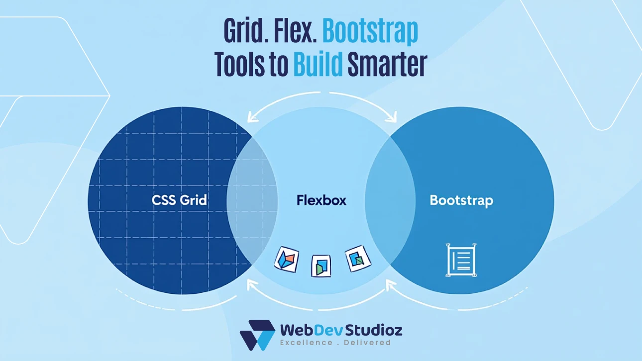
How CSS Grid, Flexbox, and Bootstrap fit the puzzle

These tools are not the goal. They are how the goal becomes real.
CSS Grid handles bigger layout regions. It shapes headers, sidebars, main areas, and footers with precise control. It also supports responsive tracks and gaps with one or two lines of CSS.
Flexbox shines inside those regions. It arranges blocks, stacks cards in rows, and keeps spacing consistent. It maintains logical code order and tidy visual order.
Bootstrap reduces setup time. Its grid, utilities, and components arrive tested and responsive out of the box. Teams can ship faster, then refine custom layers later.
Turn an existing site into a responsive one (without chaos)
A retrofit works best in steps. Start with the layout structure, then move to typography and images, then add targeted media queries.
Map key templates first. Tackle the homepage, a core product or service page, and a long-form content page. This gives a full view of components.
Plan a short sprint to convert to responsive in layers. First, replace fixed widths with fluid units. Next, apply a grid that scales. Then, write a small set of breakpoints to solve real layout pain points. Keep the CSS simple and readable.
Performance still counts
Responsive does not mean heavy. Shrink CSS where possible. Use modern image formats when they help.
Test on real devices. Touch, type, scroll, and rotate. Fix what feels slow or awkward.
Most layout bugs are small detail issues: oversized paddings, tight tap areas, or headers that grow too tall.
Real-world checklist you can copy
- List your main page types and pick core templates.
- Replace fixed widths with fluid units like %, fr, or rem.
- Build a base grid using CSS Grid or Bootstrap.
- Use Flexbox to align and space items inside components.
- Add mobile-first media queries where layouts break.
- Make images scale with max-width:100% and set clear aspect ratios.
Common mistakes to avoid
Avoid stacking too many breakpoints for tiny issues. Fix the base rules first if spacing feels off.
Watch for fixed heights on content areas. They can trim content on phones.
Do not hide key content on mobile to “simplify” the page. Reorder it. Summarize it. Keep the promise of the page intact.
Simple typography rules that scale
Start with a readable base size. Use clamp() to keep headings flexible but sane. Keep line length comfortable. A good line length is 45–75 characters.
Set line height with care. Too tight becomes unreadable on small screens. Too loose wastes space on large screens.
Use system fonts. A light font stack loads faster, which helps every device.
Micro-patterns that help everyone build
Cards should stretch fluidly but hold an inner max-width so text doesn’t run too wide. Navigation should collapse cleanly. Test long labels. Forms should stack inputs on small screens and shorten label text without hurting clarity.
Most of all, keep the CSS thoughtful. Small files, clear comments, and predictable class names make future changes safer.
Conclusion
In the end, just three things are required for responsive web design. These are flexible layouts, fluid grids, and media queries. These three keep a site consistent across screens. They convert complex pages into simple, scalable, and easily maintained systems when used with CSS Grid, Flexbox, and Bootstrap.
For teams that want a smooth shift, Web Dev Studioz can plan, build, and ship a full upgrade with care. The team maps templates, sets a modern grid, and guides content through a clean pass to convert to responsive the right way—without losing speed, rankings, or brand feel.
FAQs
1) What are the three basics of responsive web design?
Flexible layouts, fluid grids, and media queries make the foundation. Flexible layouts adapt containers, fluid grids keep spacing, and media queries switch styles at widths.
2) Is Flexbox or CSS Grid better for responsive layouts?
They solve different problems. Grid shapes the core design with rows and columns. Flexbox fine-tunes alignment and order inside components.
3) Do I still need a framework like Bootstrap for responsiveness?
Not always. Bootstrap speeds up common patterns and is well tested, but vanilla CSS Grid and Flexbox can handle most needs. Choose based on team speed and consistency.
4) What breakpoints should I use for media queries?
Let the content decide. Add breakpoints where the layout truly breaks after starting with mobile. Common widths like 480px, 768px, 1024px, and 1200px are just starting points.
5) How do I retrofit an older fixed-width site?
Begin by replacing fixed widths with relative units. Add a fluid grid, make images responsive, and then layer in media queries.
Have any Question in Mind?
Recent Blog Posts


Certified by