What Are Responsive Website Development Services and Why Do They Matter?
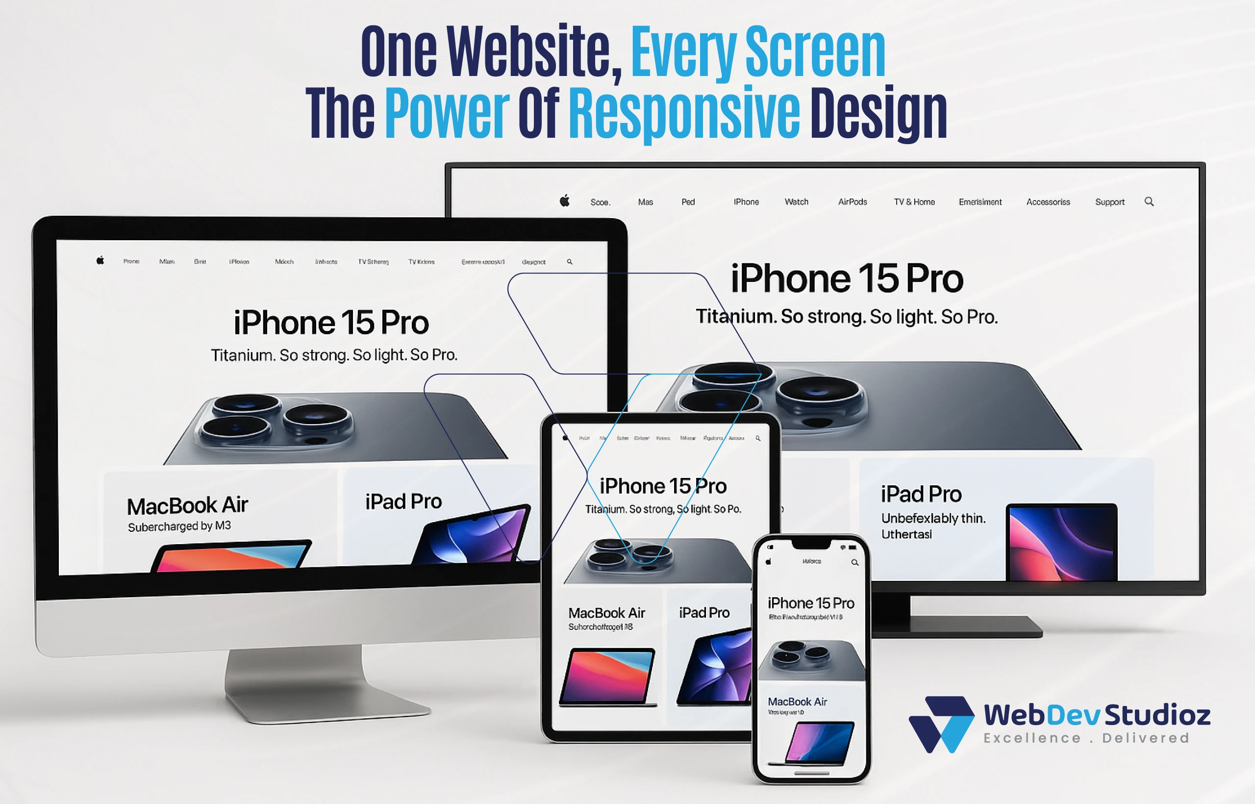
The internet looks different today. Computer browsing is no longer common. The users switch between phones, tablets, laptops, and even smart TVs. A site that looks fine on one screen can look broken on another. That is why responsive website development services matter today more than ever.
These services make sure a site works everywhere. The pages adjust to the screen. Text stays clear. Images resize. Menus stay easy to use. In short, the website feels right no matter what device someone uses. If you’re building on WordPress, choosing the right WordPress development services ensures your site is both responsive and scalable.
What are responsive website development services?
Responsive website development services mean building one site that can change its layout based on the screen size. The site works on both mobile and desktop without separate versions. It is one site that adapts.
Consider it like clay. Any mold can be shaped out of clay. The same applies to a responsive website. It adapts to a large screen, tablet, or phone. Users always get the same quality experience.
Why do responsive website development services matter?
These services matter for three reasons: people, search engines, and business results.
First, people want easy browsing. Nobody likes to zoom in or scroll sideways. If the site is slow, the user will leave it immediately.
Second, search engines like Google promote mobile-friendly sites. A responsive site can rank higher. That means more visitors.
Third, businesses win more sales. A clear site keeps people on the page longer. They trust it more. And they buy more often.
So, responsive design helps in every way.
Get Your Site Future-Ready
Build a responsive website that works on every device and boosts both trust and SEO.
How are responsive websites different from old-style websites?
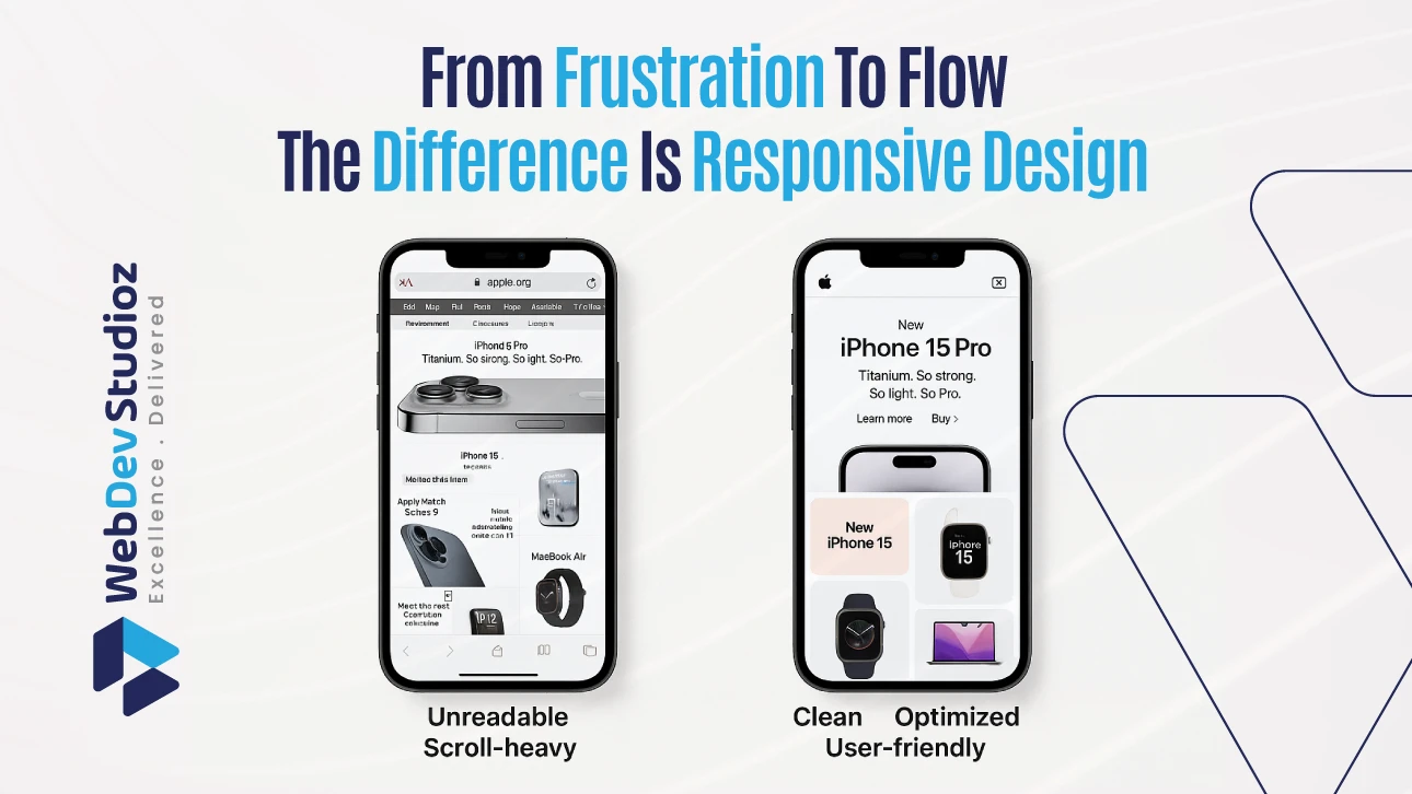
Old-style websites were built only for desktops. They looked fine on big screens. But on phones, the text shrank. Pictures went off the page. Buttons became hard to tap.
Responsive websites fix this. They use the rules of Responsive Web Design and standards from W3C (World Wide Web Consortium). The layout changes itself without breaking. Fonts stay readable. Images scale neatly. Menus stay simple.
It’s like having one outfit that fits every person without a tailor.
Main benefits of responsive websites
| Benefit | Why It Matters |
|---|---|
| Smooth experience | Works well on all screens |
| Better rankings | Google ranks mobile-ready sites higher. |
| Lower costs | One site instead of many versions |
| More engagement | Visitors stay longer and explore more. |
| Future-ready | Adapts to new devices automatically |
How do adaptive design and responsive web solutions differ?
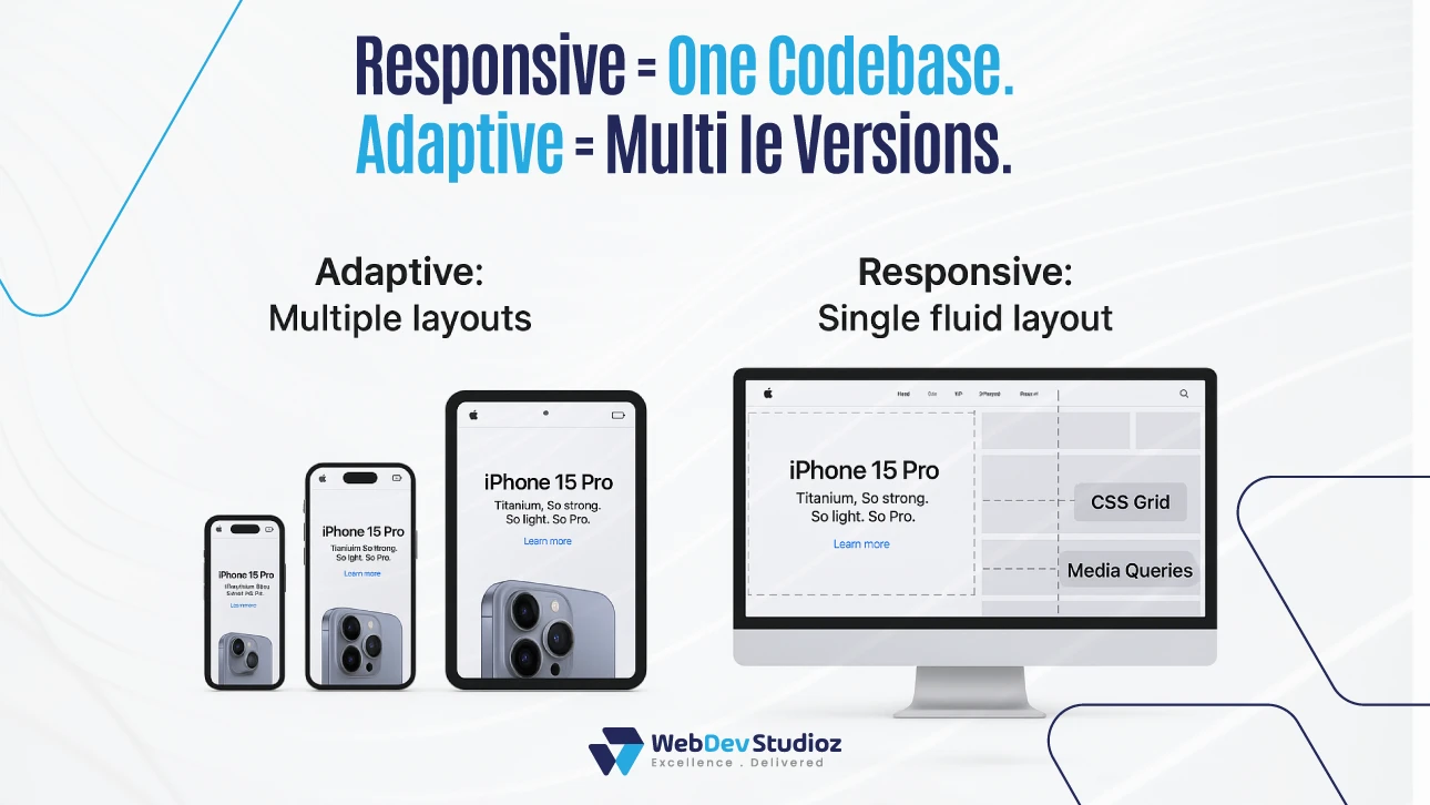
Many people confuse adaptive web design with responsive web solutions. Both help with mobile use, but they are not the same.
Adaptive design creates several fixed layouts. One version loads for phones, another for tablets, and another for desktops. It works, but it takes more work to maintain.
Responsive design uses flexible grids and code. The same site shifts around to fit any screen. No extra versions are needed. This is why most modern businesses choose responsive design.
What is mobile-first design?
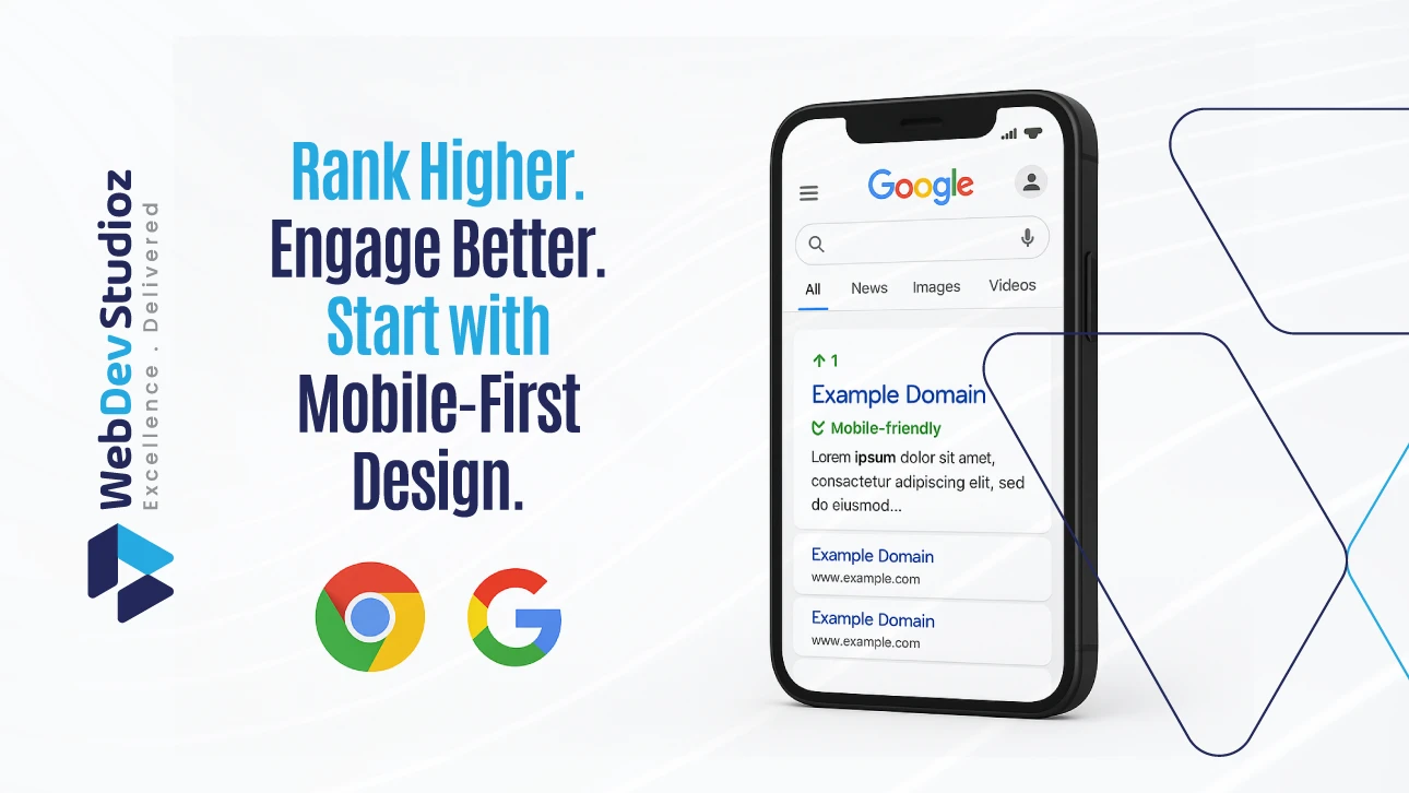
Mobile-first design means starting small. They design mobile first, then expand it. This matches real life. Most people now browse on phones before anything else.
Google also uses mobile-first indexing. That means it looks at the mobile site first. If that version is weak, rankings can drop. Building mobile-first ensures the most important users—phone users—get the best experience.
Why do scalable websites matter for the future?
Technology never stops changing. Today, we use phones, tablets, and laptops. Tomorrow, it may be smart watches and car screens. Even new devices we can’t imagine can replace them.
Scalable websites work everywhere. It is also a direct boost to SEO. The layout stretches or shrinks as needed. Businesses don’t need to rebuild their sites every time something new arrives.
It is comparable to having stretchy cloth that can accommodate a range of sizes. One site can serve everyone.
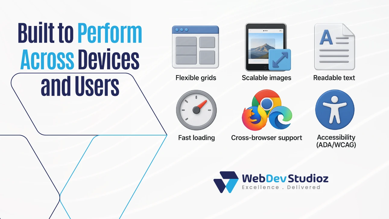
Key features of responsive website development services
| Feature | Why It Matters |
|---|---|
| Flexible grids | Layout moves smoothly on all screen sizes |
| Scalable images | Pictures load fast and fit neatly |
| Readable text | Clear on both small and large screens |
| Fast loading | Makes people and search engines happy |
| Cross-browser use | Works on Chrome, Safari, Firefox, and more |
| Accessibility rules | Meets W3C standards for all users |
How do responsive websites help SEO?
Search engines look for happy users. If people open a site and leave right away, that’s a bad sign. It means the site is hard to use.
Responsive websites keep people around longer. They scroll more. They click more. This tells search engines the site is good. That leads to higher rankings.
So, responsive design is not just about looks. It also directly improves SEO.
Which industries need responsive web solutions most?
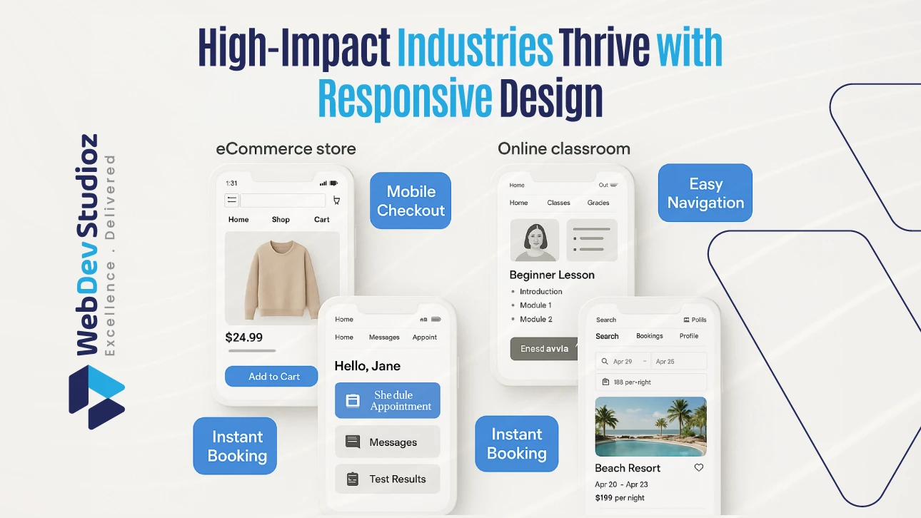
Every industry needs them, but some need them more:
Online stores
Shoppers often buy directly from phones.
Schools and colleges
Students access lessons and notes online.
Healthcare
Patients search for clinics or book visits.
Travel and hotels
People check sites while on trips.
In these fields, a slow or messy site can mean losing customers right away.
How do responsive website development services improve user trust?
When a site opens well on any screen, people relax. They do not fight with small text or broken pages. Buttons are easy to tap, and the layout feels smooth. This comfort slowly builds trust.
Responsive website development services make a business look clear and professional wherever users come from. With time, that trust keeps visitors longer, helps them return, and makes the brand stronger.
Mistakes businesses make with responsive sites
Some businesses still get it wrong.
Here are common mistakes:
- Using heavy images that load slowly.
- Forgetting to test on many devices.
- Skipping accessibility features.
- Designing for desktop first instead of mobile.
Avoiding such mistakes keeps the site easy to use.
How to choose responsive website development services
Not every company builds sites the right way.
When picking a provider, check these points:
- Do they know frameworks like Bootstrap or Foundation?
- Do they follow W3C rules for accessibility?
- Can they show real examples of scalable sites?
- Do they test across many devices?
- Do they mix design with SEO planning?
Asking these questions helps find the right partner.
Conclusion
The need for responsive website development services keeps growing. People now move from phones to tablets to laptops without thinking. A site must keep up with them. Mobile-first design and scalable websites help, but the goal is simple. One site should work on every screen. For any business that wants trust and growth, responsive website development services are no longer an extra.
These services have now become essential. And when done right, it pays off in traffic, trust, and sales.
Web Dev Studioz is here to provide that level of service. With expertise in global standards and flexible design, they help brands stay visible, strong, and ready for the future.
FAQs
- What are responsive website development services?
They are services that build one site that works on all screen sizes, ensuring users get the same smooth experience on phones, tablets, and desktops. - Do responsive sites cost more?
At first, yes. But they save money later because only one site needs updates. - Is responsive better than adaptive design?
Yes, for most businesses. Responsive is a simpler and more flexible layout that fits any screen, while adaptive design needs separate fixed versions for each device. - Does responsive design help SEO?
Yes. It keeps visitors on the site longer and improves rankings. - Which industries benefit most?
E-commerce, healthcare, education, and travel benefit the most because their users often browse and make decisions quickly on mobile devices.
Have any Question in Mind?
Recent Blog Posts


Certified by