How to Convert a Normal Website into Responsive?

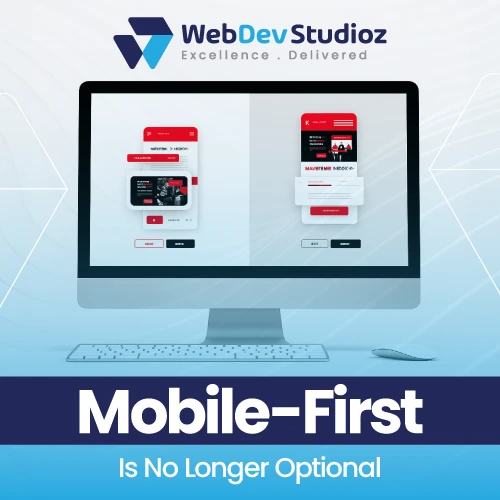
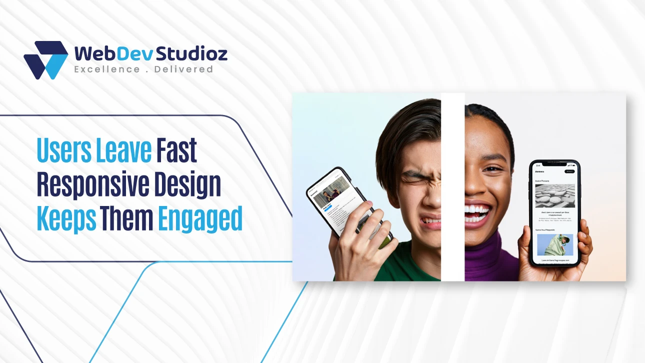
The internet is everywhere. People don’t just browse on desktops anymore. Phones, tablets, and even smart TVs are now common. A site that works on a desktop might break on smaller screens. If it happens, then you are really at a loss.

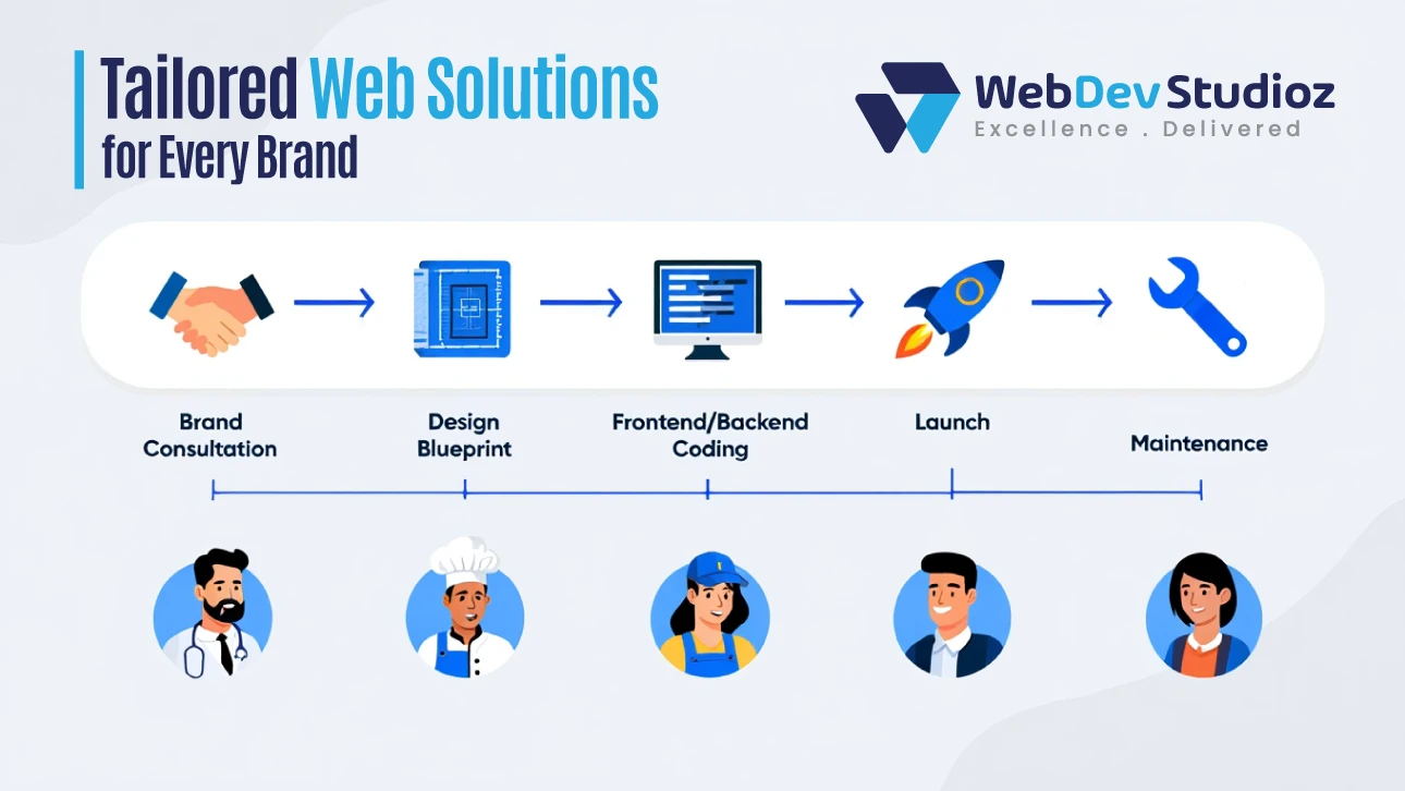
The best step is to convert a normal website into a responsive one. A responsive site adjusts on its own—text stays clear, images fit, and buttons remain easy to tap. Menus also shift neatly so visitors can scroll and read without trouble. This makes users explore more pages and engage actively.

What Does It Mean to Convert a Normal Website into a Responsive Website?

Converting a normal website into a responsive one isn’t just about changing sizes. It means redesigning it for all devices. Phones, tablets, and desktops should show the same smooth experience. Layouts, text, and images must adapt. Menus and buttons need to be touch-friendly. Responsiveness ensures content is readable everywhere. Without it, users leave quickly.

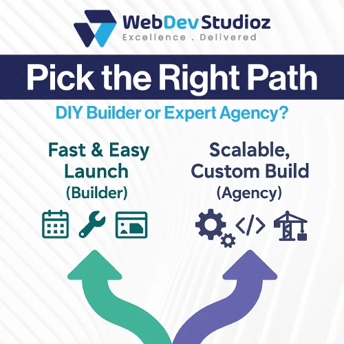
Even simple blogs or e-commerce stores lose traffic. The goal is a consistent experience. Platforms like WordPress and Shopify provide tools to help. For businesses that need expert implementation, WordPress development services can transform blogs and corporate sites, while Shopify development services ensure e-commerce stores are fully optimized for mobile shoppers. Adaptive conversion and retrofit website techniques allow updating old sites without a full rebuild. It’s essential for today’s mobile-first world.

Why Should You Upgrade Old Websites?

Old websites may look fine on desktops. But mobile users face problems. The buttons are too small. Menus break. Images don’t resize. Upgrading fixes these issues. It also improves SEO and enhances usability.

Visitors can navigate easily. Older sites may not support modern devices. Upgrading keeps them relevant. Mobile users dominate online traffic. Even small businesses see higher engagement with responsive sites. Conversion rates improve.

What Are the Three Basic Things Required for Responsive Web Design?

Every screen is different. Phones, tablets, laptops, and desktops are all now used for browsing. That is why the basic things required for responsive web design matter so much. They keep layouts clean, readable, and fast on any device, without building a separate site for each screen. If you’re upgrading or scaling a site, pairing responsive design with professional WordPress development services can make the transition smoother and future-proof.

What are the basic things required for responsive web design?

The basic things required for responsive web design are flexible layouts, fluid grids, and media queries. Together, they let a page shift with the viewport, preserve proportion, and apply smart rules. In simple terms, the layout adapts, the math scales, and the styles switch when needed.

In practice, flexible layouts prevent cramped designs, fluid grids keep spacing in balance, and media queries handle the fine-tuning. These three responsive essentials form the stable base of modern front-end work.

Why these three matter right now

Responsive web design breakpoints chart showing 320px, 480px, 768px, 1024px, and 1200px screen widths for mobile, tablet, and desktop layouts.

Visitors judge a site in seconds. If the text is tiny or buttons overlap, they leave. These three core pillars reduce that friction. They help pages load cleanly, scale gracefully, and feel consistent across devices.

There is also a search angle. Mobile usability affects visibility. A site that reads well on small screens can hold attention longer. Engagement sends better signals.

Should You Use a Responsive Website Builder or Hire a Development Agency?

Most buyers come to a site through their phones. Screens change, attention is short, and first impressions decide trust. That is why the choice between a responsive website builder and a professional agency matters so much. The path sets the tone for speed, cost, control, and how the site grows over time.

This guide keeps things simple. It explains where builders shine, where agencies win, and how to match the option to real goals.

Which is smarter today: a responsive website builder or a development agency?

A responsive website builder works best when the goal is to launch fast on a small budget. A development agency is the better route when a brand needs depth, unique design, and room to scale. Both can ship a good site, but they solve different problems.

In other words, pick a builder for speed and a clean start. Choose an agency for custom responsive development that supports growth and complex features over the long run.

Which Framework Is Commonly Used for Responsive Web Design?

A modern site must look right on every screen. That is why teams lean on a framework for responsive web design. A framework for responsive web design reduces build time, maintains consistent layouts, and enables pages to adjust smoothly on phones, tablets, and large monitors.

This guide shows what “most used” really means, how to choose with confidence, and when skipping a framework makes sense. It also compares the leading options with clear, simple tables and ends with FAQs people actually ask. If you’re exploring frameworks as part of larger WordPress development services, the same principles apply—choose tools that fit your goals, not just what’s trending.

Which framework for responsive web design is used most today?

Comparison of Bootstrap, Tailwind CSS, and Foundation frameworks by ease, speed, design control, and ecosystem size.

When it comes to picking a framework for responsive web design, there isn’t a one-size answer. Bootstrap is everywhere. There are different reasons for it, mostly because it’s fast, steady, and packed with components people already know. Tailwind CSS feels different—it’s lighter, gives more control, and has been catching on quickly.

Foundation hasn’t disappeared either; big teams often stick with it since it covers accessibility and works well at scale. Honestly, the best call depends on what the project is about, the limits in place, and how skilled the team really is.

Website Design vs Website Development: A Quick Guide

Ever wondered what the real difference is between website design and website development? Both terms look similar, but deeply, both have different paths and meanings. It is a common confusion, especially for business owners diving into the world of digital presence for the first time. Whether you want web development & design services, a professional place like Web Dev Studioz can assist you.

In this blog post, we will dive into website design vs website development differences. We will explore their unique roles in building a successful website, and help you understand why both are essential. Further, we suggest you get help from Web Dev Studioz to make your online presence strong.

What is Web Design?

Before diving into the difference between the two terms, let us understand them separately. So, what is web design? It is all about the visual appearance and user experience (UX) of your website. It determines how your website feels, functions, and flows from a users perspective. A good design creates aesthetic appeal, ensures usability, and drives engagement.

Headless CMS Vs Traditional: What You Should Know

Are you struggling to manage your content across multiple platforms? A robust Content Management System (CMS) can handle a lot of data without compromising performance and user experience. In this digital age, speed, flexibility, and cross-platform consistency are necessary, and that is where a headless CMS plays an important role.

Choosing the right CMS directly affects your content strategy, and you can get it from a professional platform, Web Dev Studioz. In this blog, we will discuss the main difference between a Headless CMS and a traditional CMS. We will explain how a professional platform can help businesses adapt and grow with the right technology stack.

What is a Headless CMS?

Headless CMS architecture for omnichannel content delivery using API-based backend and frontend integration

Before diving into the comparison of different types of CMS, you should know exactly what a headless CMS is. It is a content management system where the backend (content storage and management) is separated, or “decoupled,” from the frontend (content presentation layer).

This architecture gives developers complete freedom to deliver content on any platform. For example, delivery of content not only on websites but also on mobile apps, smartwatches, IoT devices, and more.

Key Features of a Headless CMS

Key features of Headless CMS including decoupled structure, API delivery, and omnichannel publishing.

Let us consider some key features of a headless CMS:

Decoupled Structure

The main feature of this CMS is its decoupled structure. As the name headless shows, the “head” (frontend) is removed from the body (backend), allowing content to be delivered via APIs to any digital interface.

Content API Delivery

Content delivery is the key task of any CMS. In this category, content is retrieved through RESTful or GraphQL APIs. Retrieving enables real-time and structured content delivery. Content delivery is the key task of any CMS. In this category, content is retrieved through RESTful or GraphQL APIs. Retrieving enables real-time and structured content delivery. You can streamline and scale this process with expert API development for CMS architectures.

Omnichannel Publishing

Content can be published across multiple channels such as websites, mobile applications, AR/VR, and digital signage. You can publish content without being locked into a specific front end.

Headless CMS is a modern strategy to manage content that gives a fast and scalable experience to businesses.

Also Read: Top Website Development Tools That Make Building Faster, Easier, and Smarter

Why Is Web Dev Studioz the Go-To Agency for Website Development?

Want to build an online empire for your business? Start from a well-structured and functional website. Nowadays, a website is a necessity to expand your brand to a wide audience. No doubt, you can also build a website by yourself, but it cannot compete with a professionally designed and customized site.

Choose a professional and expert company for website development, such as Web Dev Studioz. In this article, we will discuss how this expert agency has earned its name as the go-to agency for businesses that demand nothing but the best. Further, we will also prove why it is best for all kinds of development services.

A Full-Spectrum Website Development Powerhouse

Web Dev Studioz is not only a group of coders, but it is a complete platform that handles your website from scratch to online availability. Their expertise spans everything from e-commerce solutions to WordPress development services, UI/UX design, and full-stack coding—ensuring your site is both powerful and user-friendly

  • E-commerce web development
  • WordPress web development
  • UI/UX designing
  • Front and Backend Development

Their skilled team can code and design your business in such a way that every visitor will become a potential customer. An expert team has command of all coding languages such as HTML5, CSS3, and JavaScript. This web development agency makes sure that your online platform is appealing, convincing, and user-friendly.

Expertise in Custom Websites That Reflect Your Brand

Web Dev Studioz tailored web solutions process—brand consultation, design blueprint, frontend and backend coding, launch, and maintenance.

Web Dev Studioz understands that every business niche needs a unique and specific website. For example, a kids’ accessories website will have different themes, and a gaming website will have different ones. That is why they design custom websites according to the needs of brands.

The team starts with deep consultations to understand your target audience, brand message, and unique selling points. Then, they start working on it. They have different developers for different tasks. For example, for designing UI designers, for coding front-end and back-end developers, for logo and themes, expert graphic designers.

Why Should You Migrate Your Website to Webflow with Web Dev Studioz?

Do you feel your website is outdated or faces unnecessary updates? Then, it is an alarming situation and an indication of conversion to Webflow. In this digital world, your website is not only a digital address but also your brand’s first impression, primary marketing tool, and customer engagement hub. That is why you should choose a team of experts for the migration of your website to Webflow. Partnering with professionals who specialize in Webflow development services ensures your site not only looks modern but also performs seamlessly.

In this article, we will describe the reasons that led your website to migrate to Webflow. For this, we will suggest to you Web Dev Studioz, which is ideal for seamless migration of your website to Webflow.

What Is Webflow, and Why Does It Matter?

Why Webflow? Clean code, no plugins, visual editing, fast load, built-in CMS, SEO-ready – Web Dev Studioz


Webflow is a powerful web design and development platform that combines traditional coding with a visual editor. You can get custom designs without writing complex code with this flexibility. Today, most businesses are eager to migrate to the Webflow platform.

It helps designers and marketers create professional, responsive, and visually stunning websites. Unlike traditional platforms like WordPress, which require plugins, themes, and frequent updates, Webflow offers a single solution for CMS.

Top Reasons to Migrate to Webflow

Many brands do not focus on the upgrade of old theme websites. They cannot compete in today’s saturated marketplace and face many website issues in the future. These issues lead to slow functionality of the websites.

Some top reasons to migrate to Webflow are as follows: